Strategy ONE
Customize the Appearance of Linear Trend Analysis Line Charts
Make your trend visually stand out by customizing the appearance of your Trend Line Chart. Adjust colors, fonts, and labels to match your preferences and create a chart that's not only insightful but also looks great.
By default, the trend line takes the first color from the chosen color palette. However, users can customize the color, data labels, markers, and divider line of the trend line chart on the Format panel.
Customize Trend Lines and Lines
-
In the Format panel, click Text and Form
 .
. -
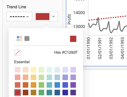
Select Trend line from the drop down.
-
Choose a trend line style and color.
-
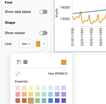
Select Data Labels and Shape from the drop down.
-
Under Shape, select a line style and color.
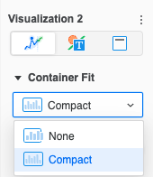
Visualization Container Fit
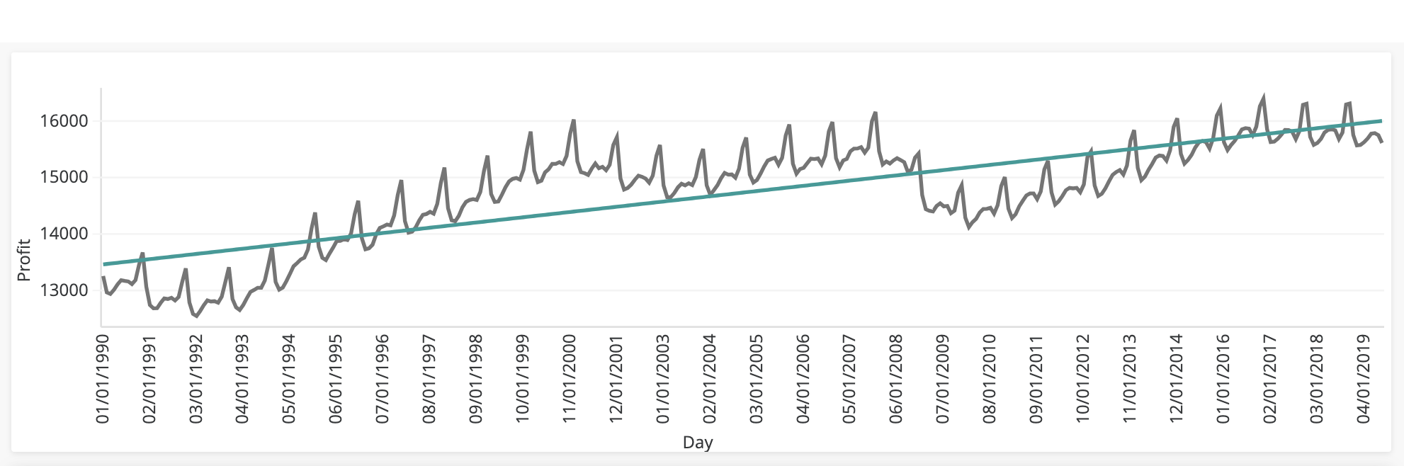
The Time Series Trend visualization appears in compact mode by default. All data is condensed so that it appears within the visualization container from end to end. If you want to see more granular details, change to Container Fit: None.
-
In the Format panel, click Visualization Options
 .
. -
In the Container Fit drop down, select an option. None allows you to scroll horizontally to view your data points in more detail.