Strategy One
Create a Synchronized Axis Bar Chart
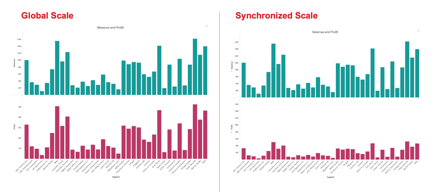
In a bar chart, the scale (normal vs. log) and range (min to max) of the y-axis is critical to understanding business metrics like revenue and expenses. In dual-axis bar charts, where two metrics are displayed side-by-side, a common y-axis scale immediately summarizes the differences between these two metrics.
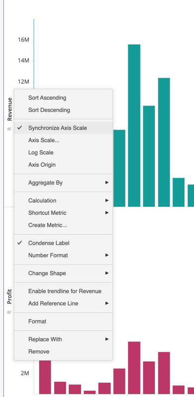
For example, from a quick glance at this chart on the left, it appears as though revenue and profit are almost the same, which is misleading to end users. As seen in the chart on the right, the Synchronized Axis Bar Chart allows users to quickly visually understand the true relationship. Users can enable this on existing dual bar charts by right-mouse-clicking the axis or changing the visualization type to Synchronized Axis Bar Chart.
- Open a dashboard.
-
In the top toolbar, click

- Choose Bar > Synchronized Axis Bar Chart.
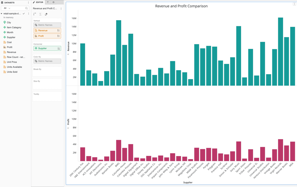
- Double-click to add at least two metrics and one attribute.
-
To unsync, right-mouse-click the axis and deselect Synchronize Axis Scale.