Strategy One
Create a Gauge Visualization
Easily display and compare one or more key metrics on a scale using thresholds with a Gauge visualization. Gauges provide quick readouts, like the dashboard of a car. Check out this example of a dashboard that contains a gauge visualization.
Check out the video below to learn more!
- Open a dashboard.
-
In the top toolbar, click

- Choose KPI > Gauge
 .
. - Add a minimum of at least one metric. If the data is available in the Datasets panel, add the relevant metrics to each drop zone. Otherwise, start with your metric and use the Format panel to add reference lines and to set the minimum and maximum values, as needed.
-
Set axis level formatting in the Visualization Options section of the Format panel.
Under Axis, select Number to set the number of labels on the Gauge. For example, if you choose 5 and your scale is 0 to 100, 0, 25, 50, 75, 100 appear as the axis labels.
Select Interval to set the range between data points. For example, if you choose 15 as the interval, then you must determine the step between data points so the scale will be 0, 15, 30, 45, 60, and so on. up to 100.
Select Graduated scale to determine the number of dashes between the main values. Control the line style and color from the Text and Form section of the Format panel.
-
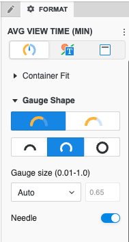
Control the look and feel by choosing between round or square edges, displaying a needle, and matching the colors to your design. You can also control the axis range using metrics on the visualization or constant values. Add reference lines and control their display.
-
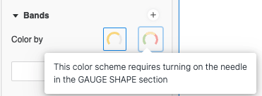
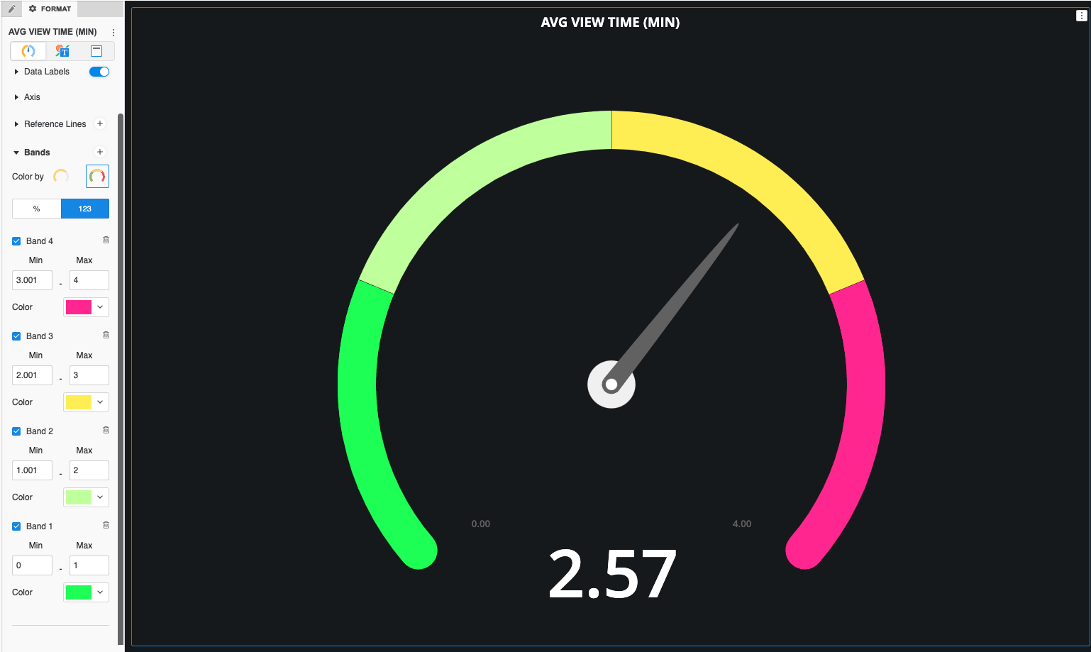
Add bands to color different thresholds.
To use Color By All Bands, the needle must be turned on so the current value is visually represented.