MicroStrategy ONE
Scatter Plot
A Scatter plot is a graph showing points of data that are not connected by a line. A Scatter plot can help you identify the relationships that exist between different values. Each dot on the graph represents the intersection of the data on the X and Y axes. For example, if you are looking at numeric profit data on a report, the profits of various call centers are clear. However, when you display the report as a Scatter plot, the visualization of the data reveals that a certain call center is performing significantly better than other call centers.
Scatter plots are often used for quality control and management. However, like most graph styles, they are also useful because of their distinct visual style.
Scatter Plot Graph Types
You can create several different types of Scatter plots in MicroStrategy, including the following:
- X-Y Scatter
- Dual-axis X-Y Scatter
- X-Y-Z Scatter Chart (three-dimensional)
Scatter: X-Y Graph Example
In the Scatter: X-Y graph below, the revenue generated by each customer appears along the X-axis, while the customer satisfaction for each customer appears along the Y-axis. The individual circles within the graph represent each customer.
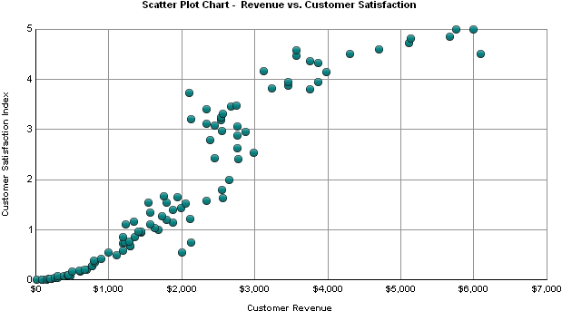
This graph report, named Scatter Plot Chart - Revenue vs. Customer Satisfaction, is available in the MicroStrategy Tutorial project.
The Scatter plot shown above helps to show the relationship between a customer's satisfaction with a company and how much revenue is generated by a customer. This graph suggests that customers who are satisfied with the company are likely to spend more money with the company.
Using Scatter Plots Effectively
- While a Scatter plot is a flexible graph format because you can create one from a number of report objects, its minimum requirements are that one attribute and two metrics be present on the report grid. However, as explained in Moving Objects on a Graph Report, the location of these objects on your grid report determines whether and how the grid report can be generated as a Scatter plot.
- If you include more than two metrics on the report grid for a Scatter plot like the one shown above, the graph may not be useful because Scatter plots are specifically designed to plot two distinct metric values. You can include three metrics on Scatter: X-Y-Z graphs, which display the metric values on a three-dimensional Scatter plot.
- If you include only one metric on the report grid and apply a Scatter plot graph style, an error message notifies you that there is not enough data to create the Scatter plot. For details on how the placement of objects on a report can affect the display of data for various graph styles, see Placement of Report Objects and Choice of Graph Styles.
- For detailed information about the specific options for Scatter plots in MicroStrategy, see the MicroStrategy Developer help.