Strategy One
Create a Donut Chart
Starting in Strategy One (March 2026), you can add an attribute and metric to the Break by and Target sections in the Editor Panel to support multiple donut charts and progress bar with target values.
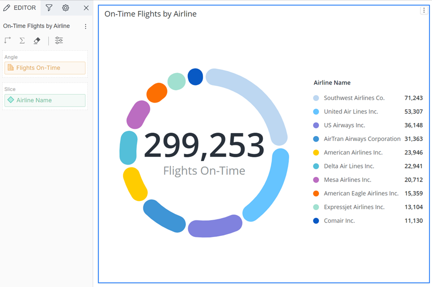
Starting in Strategy One (December 2025), you can view the contribution of attribute elements to a total by displaying your data in a modern-looking donut chart. A donut chart is a circular chart with a hole in the middle, like a donut, that displays the KPI. The chart is divided into segments, each representing a portion of the whole. In the simple example shown below, the segments are different airlines, proportioned for the number of on-time flights. The metric name (Flights On-Time) and total metric value display in the middle of the donut as labels. A legend displays to the side, but dynamically moves as the chart or screen is resized. You can decide to hide one or both of the labels and also hide the legend. (See Format Panel for Donut Chart Visualizations.)
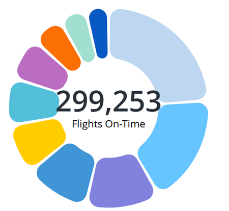
In its default formatting, a donut chart resembles a ring chart. You can decrease the inner ratio so that it looks more like a pie chart. The example above uses an 80% ratio; the example below uses 50%.
Interact with a Donut Chart
Interact with a donut chart to explore your data, quickly discovering which segments contribute the most or least to the key business metric. Use the information to prioritize areas for attention or reward.
After you assess the summary presented by the donut chart, you can dive deeper into your data.
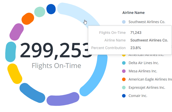
To view the exact values of a segment by hovering your cursor over it. Knowing the exact contribution can guide resource allocation, identify outliers, or highlight opportunities for improvement. In the example below, the airline name, number of on-time flights, and percent contribution display in a pop-up. This speeds insight discovery especially if the legend is hidden.
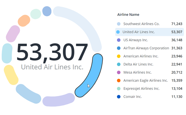
To display a segment's information in the label, click the segment. The selected segment is highlighted in the legend. In the example below, United Air Lines is selected in the donut, so the its name and number of on-time flights (53,307) display in the middle. This provides a better understandng of the data.
In the same way, if you hover your cursor over an element in the legend, the segment is selected in the donut and the label displays its information.
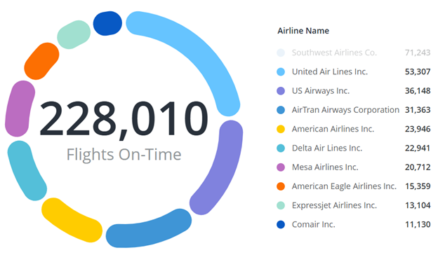
Filter the segments to perform scenario analysis, such as the impact or removing a product line or losing a partner. Click a segment in the legend to remove it from the donut. The total metric value in the label updates, and the remaining elements adjust to show their proportions to the new total. In the example below, Southwest Airlines is filtered out and the new on-time flight total is 228,010. This answer the question "What does the market look like without Southwest Airlines?".
You can filter out any number of segments. To add a filtered segment back to the donut chart, click it in the legend. Filter to model different combinations to understand how each affects the whole. Use the flexibility to underpin robust forecasting, risk analysis, and strategic planning.
When to Use a Donut Chart
While similar to a pie chart, the donut chart provides space for additional information or improved aesthetics. They are best for illustrating simple splits of data rather than displaying many categories or comparing exact values. For more complex scenarios using more metrics and attributes, create pie and ring charts displayed in a grid, scatter chart, or bubble layout. Use bar charts for more detailed analysis or comparisons.
Use a donut chart to:
-
Show proportions or percentages of categories within a whole such as expense breakdowns within a budget
-
Visualize part-to-whole relationships such as market share or budget allocation
-
Display optional, additional information in the center (the total metric value and/or the metric name)
To Create a Donut Chart
- Open a dashboard.
-
In the toolbar, click

-
Point to Pie and select Donut Chart
 .
. - In the Datasets panel, double-click an attribute and a metric to define the visualization. A donut chart requires one attribute and one metric.
To Create a Progress Donut Chart
-
Open a dashboard.
-
In the toolbar, click
-
Point to Pie and select Progress Donut Chart.
-
In the Datasets panel, double-click attributes and metrics to define the visualization. A progress donut chart requires two attributes and two metrics.
-
The progress donut chart now displays.
For steps to format the donut chart, see Format Panel for Donut Chart Visualizations.