MicroStrategy ONE
Displaying outline results
You can create an indented grouping of related data on a grid report or a Report Services document by organizing the data into a standard outline style. Using an outline style of organization in MicroStrategy, you can collapse and expand sections of related data.
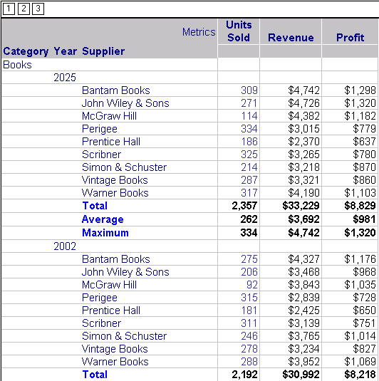
The image below shows just a small portion of an outlined report expanded completely. The outline style is controlled with the numbered buttons that appear in the top left corner of the report. For this image, button 3 was clicked, which expands the outline down to its third level. In this case, the third level is Supplier. Note that most of the report data cannot be viewed without scrolling, but each item of data and its related metric numbers can be seen clearly:

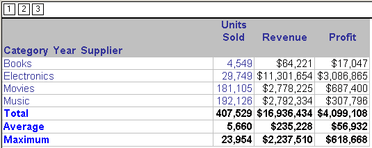
The next image shows the same report as in the images above, but with all data levels collapsed fully (button 1 in the top left corner was clicked). Note that this outline level provides the highest summary of data:

For an example of the report with the lowest level of data collapsed and only the higher levels of data expanded (button 2 in the top left corner was clicked), see the Analyzing Data chapter of the Basic Reporting Help.
Outlining is particularly useful when information displayed would otherwise involve repetitive entries. For example, you want to display sales for three years, 2025, 2026, and 2027. You also want data listed by month within each of the years. Rather than having all data visible for every month of every year, you can use an outline to expand and view just that data you want to see immediately, and keep other data collapsed, to be expanded later for quick comparisons.
The outline style is controlled with the numbered buttons that appear in the top left corner of the report when Outline mode is enabled.
Outline Mode works the same for Grid/Graphs on a Report Services document as it does for reports.
For more information, refer to the following:
