Strategy ONE
Time Series Trend Analysis
Time series linear trend analysis is a robust method enabling organizations to recognize clear upward or downward trajectories in their historical data. At its essence, it focuses on data points charted over consecutive time intervals, with a prime objective of detecting consistent linear tendencies without the distractions of short-term fluctuations. This form of analysis stands out for its precision in mapping out long-term developments and guiding strategic planning. By leveraging sophisticated statistical techniques, Strategy's linear trend analysis provides a streamlined and user-friendly interface to detect and understand persistent trends in datasets. Whether you are data scientist, head of operations, or sales leader, this tool presents a platform to understand market trajectories, make proactive adjustments, and optimize long-term goals. This analytic refinement replaces traditional, often tedious methods, ensuring that users save significant time while drawing insights more effectively.
Access Time Series Trend Analysis
Linear trend analysis is available in the following ways:
-
Through the visualization gallery in a dashboard, using a drag and drop interface to create a Linear Trend Analysis Line Chart visualization.
-
Auto can utilize natural language queries to perform trend analysis.
Create Trend Analysis Line Charts
-
Open a dashboard for editing.
-
In the top toolbar, click

-
Choose Insight+ > Linear Trend Line Chart
 .
. -
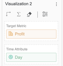
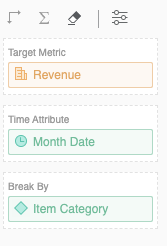
Drag a metric and time attribute from the Datasets panel to the Editor panel.
-
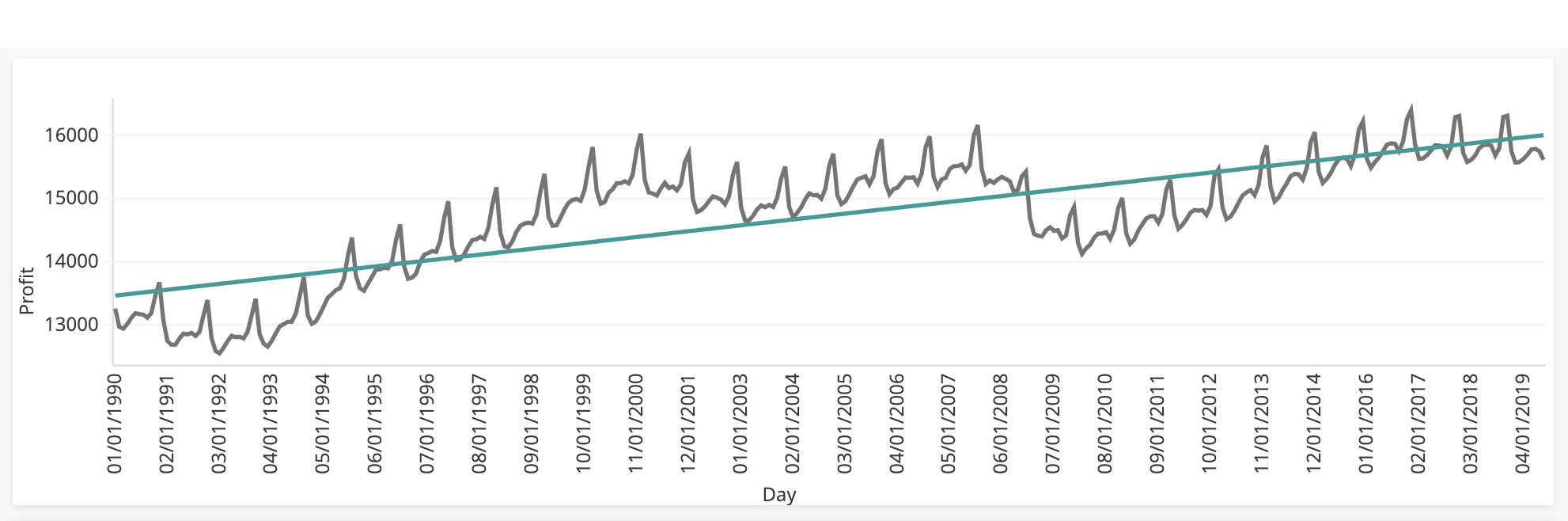
View the rendered visualization. You can scroll to the right to view all provided values, if necessary.
-
-
Customize the Appearance of Linear Trend Analysis Line Charts
Make your trend visually stand out by customizing the appearance of your Trend Line Chart. Adjust colors, fonts, and labels to match your preferences and create a chart that's not only insightful but also looks great.
By default, the trend line takes the first color from the chosen color palette. However, users can customize the color, data labels, markers, and divider line of the trend line chart on the Format panel.
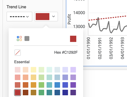
Customize Trend Lines and Lines
-
In the Format panel, click Text and Form
 .
. -
Select Trend line from the drop down.
-
Choose a trend line style and color.
-
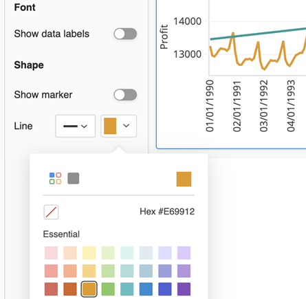
Select Data Labels and Shape from the drop down.
-
Under Shape, select a line style and color.
Visualization Container Fit
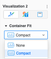
The Time Series Trend visualization appears in compact mode by default. All data is condensed so that it appears within the visualization container from end to end. If you want to see more granular details, change to Container Fit: None.
-
In the Format panel, click Visualization Options
 .
. -
In the Container Fit drop down, select an option. None allows you to scroll horizontally to view your data points in more detail.

Use Auto Answers for Linear Trend Analysis
To get insights from linear trend analysis using Auto Answers, simply phrase your trend inquiry in everyday language. For instance, ask "What is the trend for Profit in the last year?" Auto Answers delivers a precise trend analysis based on your question, its comprehensive grasp of your dataset, and refined statistical methods. To include break by analysis, you can ask "What is the trend for Revenue over Date broken down by Category?".
Auto Answer's response consists of a clear natural language description of the observed linear trend alongside a trend line chart visualization, ensuring you have a clear perspective on the historical trend path. By incorporating the break by functionality in your trend analysis inquiries, you can easily obtain insights on trends specific to different attribute elements and ensure that you have a comprehensive understanding of the historical trend paths. The visualization is rendered to fit all data points from the input range into compact . This allows you to quickly glance through your data and better understand its relation to the trend line. To dive deeper into the result, the visualization's expanded mode found in top right corner.
Here's how you can delve into predictions using Auto Answers. Auto Answers is in expanded mode for the following examples:
-
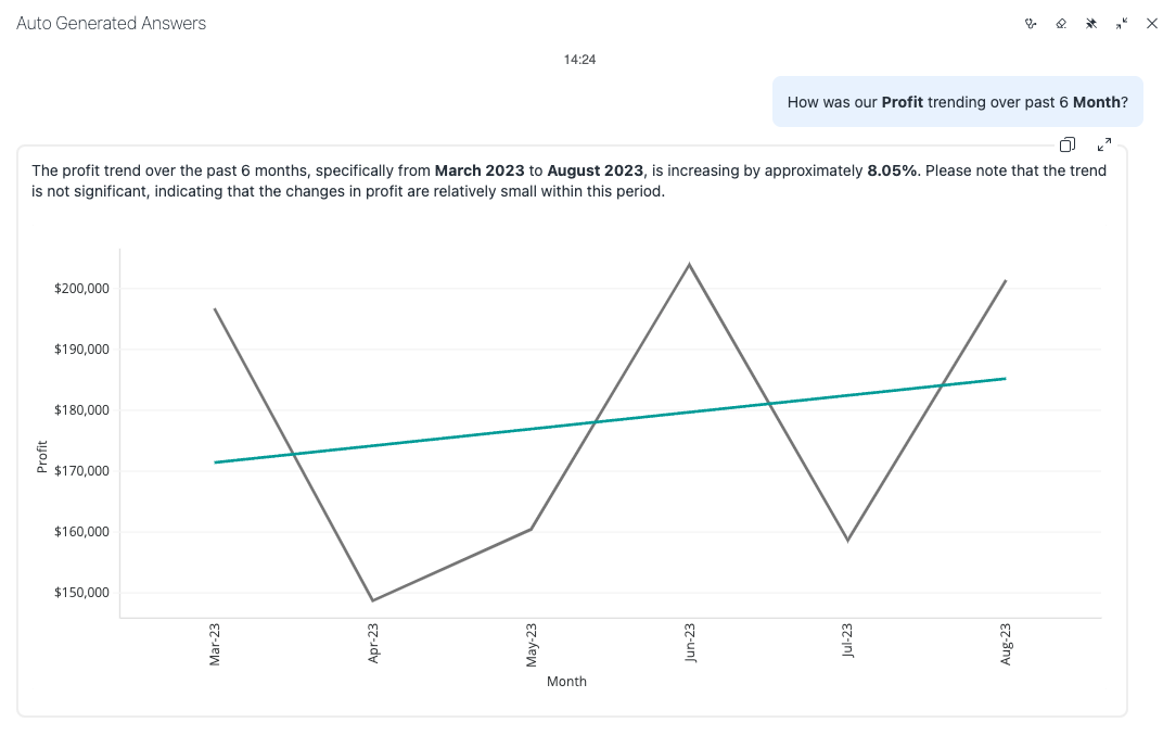
Last Few Months Trend Start with a given monthly sales dataset. You can ask Auto Answers to plot the sales trend for the last few months. The algorithm adeptly handles the task even if you're requesting a trend for an entire year based on monthly data.
Ask the question, "How was our Profit trending over past 6 months?"
-
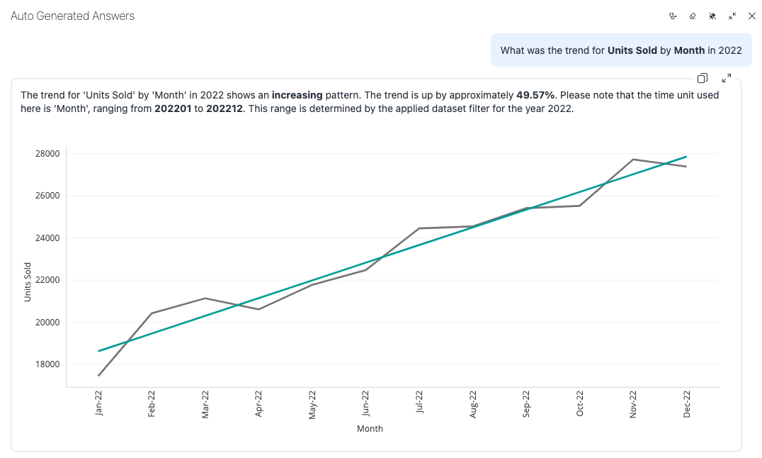
Trend Over Periods Auto Answers can also handle trend generation over time durations. Use historical monthly data to plot trend for past events.
Ask the question, "What was the trend for Units Sold by Month in 2022?"
-
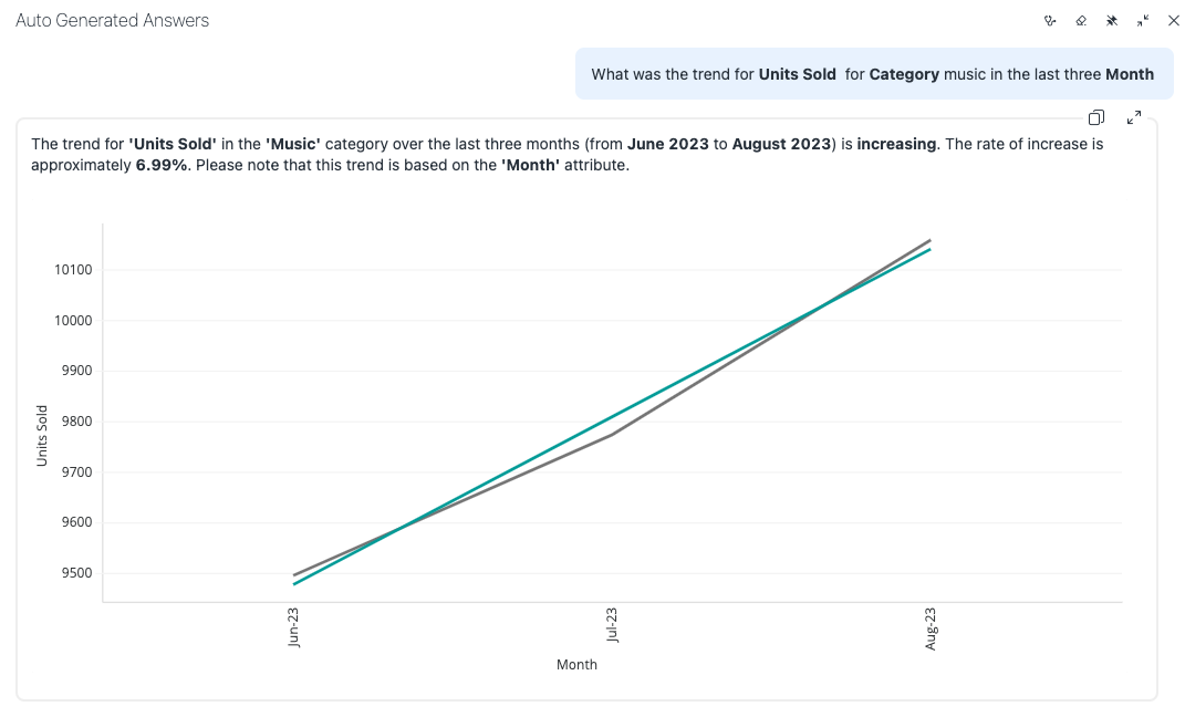
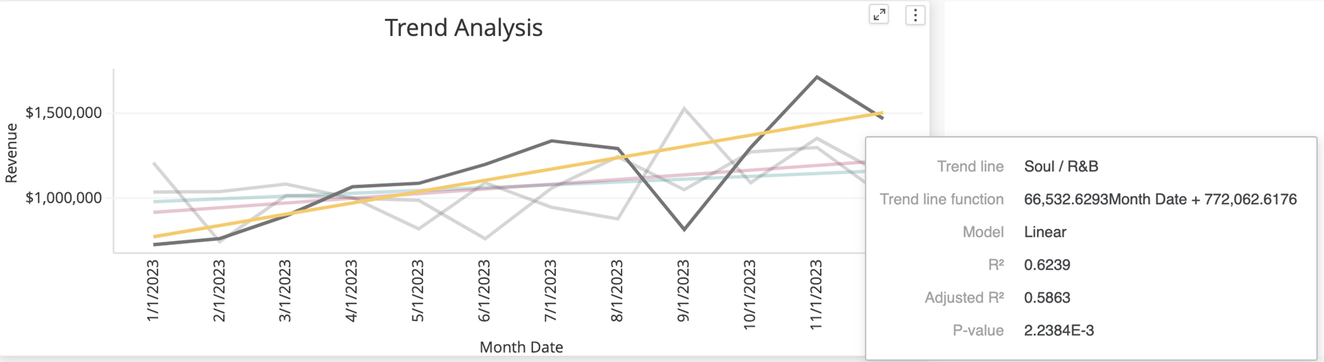
Applying Filters Trend Analysis can also be filtered. The example below demonstrates trend analysis for the last three months, considering a specific category like music. Keep in mind that the month attribute is represented as an integer, not a time-based value.
Ask the question, "What was the trend for Units Sold for Category music in the last three Month?"