Strategy ONE
Response Structure
Understanding the response
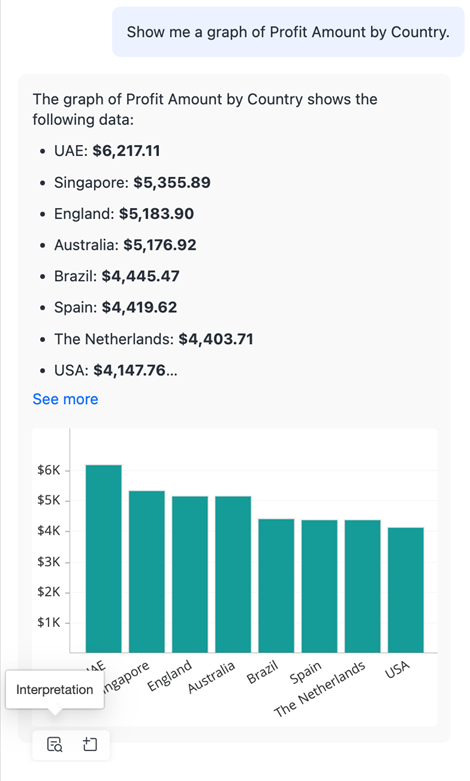
Auto Dashboard provides responses comprising natural language text and an accompanying visualization. The chatbot supports a range of visualization types, including Grid, Vertical, Horizontal, and Clustered Bar Charts, Pie Chart, Line Chart, KPI, Heat Map, Mapbox, Bubble Chart, Key Driver Analysis, and Insight Line Charts for trend and forecasting analysis. Auto Dashboard intelligently chooses the appropriate visualization type based on the analysis requested and the number of rows in the answer, enhancing the consumability and readability of insights. For example, Ranking Analysis uses Horizontal Bar Charts, Trend Analysis uses Line Charts, Combo Charts, or Area Charts, Anomalies/Correlations use Bubble Charts, Location-based Analysis uses Mapbox, Distribution Analysis uses Pie Charts or Heat Maps, and Descriptive Statistics default to Bar Charts. Users can also explicitly state their desired visualization type, and Auto Answers will generate it, provided the input parameters meet the conditions required for that visualization.
For more information on how visualization types are selected by Auto, see Question Construction Best Practices.
The response is accompanied by a navigation panel, which becomes visible in the bottom left corner when you hover over the response. You can:
- Request for interpretation
- Add the visualization to the page

When asking questions in Auto Dashboard, you might notice variations in the narrative or visualization types for the same query, while the numerical data remains accurate. For example, querying "Which stores had consistent improvements in revenue?" may result in slightly different summaries each time, but the list of stores will be consistent. This variation stems from the non-deterministic nature of the Large Language Model (LLM), which aims to provide the most relevant and accurate response each time a question is asked, even if it means altering the approach slightly.
