MicroStrategy ONE
Displaying data in a Heat Map widget
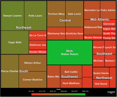
The Heat Map widget for the iPad and Android tablet displays elements as rectangles and lets users quickly grasp the state and impact of a large number of variables at one time. An example of the Heat Map widget on the iPad is shown below:
You can also use the Heat Map visualization in dashboards. For information on creating analyses, refer to the MicroStrategy Web Help.
By default, the header for each group in a Heat Map widget is displayed in the middle of the group. For example, in the Heat Map widget above, Northeast is displayed in the middle of all elements that belong to Northeast. For steps to display headers at the top of the widget, see the procedure below.
You can define an Information Window that displays when a rectangle is tapped. For instructions on creating an Information Window, see Providing additional information to users: Information Windows.
You can create a link on one of the attributes in the widget that opens a report or another document.