MicroStrategy ONE
Allowing users to access information easily: mobile-friendly panel stacks
In addition to the standard features supported by panels in documents, you can use the following features to make viewing data in your app easy for users:
-
Allow users to easily switch between panels by tapping on circles displayed in a docked panel selector that appears at the bottom of a panel stack. See Allowing users to easily switch between panels: docked panel selectors.
-
Allow users to switch between panels by swiping. See Allowing users to switch panels by swiping.
-
Save screen space by using an Information Window, which is a pop-up window that can display additional details when users tap a selector in a document or a marker in a map widget. See Providing additional information to users: Information Windows.
-
In documents for iPad, determine whether a panel stack resets to the first panel when an attribute selector that targets the panel stack is changed. See Resetting panel stacks when selectors are changed.
Allowing users to easily switch between panels: docked panel selectors
A docked panel selector allows users to switch between panels by tapping on circles displayed on a selector bar that appears at the bottom of a panel stack. An example of a panel with a docked selector on the iPad is shown below:
A row of circles, each representing a panel, is displayed in the center of the selector. The current panel is marked with a dark circle.
You can use a docked panel selector in an app to display multiple graphs or widgets in one space. You can also use the docked panel selector with a panel stack to create an interactive slide show, where the information in one panel progresses naturally to the information displayed in the next.
The steps to create a docked panel selector are described below.
To create a docked panel selector
-
In MicroStrategy Web, create a new document, or open an existing document in Design Mode.
-
From the Insert menu, choose Panel Stack. When you move the mouse cursor to the Layout area, the pointer changes to crosshair.
-
Click and drag in the Layout area to create the panel stack.
To create and configure a selector for the panel stack
-
Right-click the panel stack, and choose Create Panel Selector. A drop-down selector appears above the panel stack.
-
Right-click the panel selector and choose Properties and Formatting. The Properties and Formatting dialog box appears.
-
From the left, choose the Selector category.
-
Under Mobile, ensure that the Display selector docked to its panel stack check box is enabled.
-
Click OK to save the changes.
To add panels and content to the panel stack
-
Hover the mouse cursor over the panel stack. A toolbar appears above the panel stack.
-
Click Add Panel to add panels to the stack.
-
For each panel, click Add Content, and add grids or graphs to the panel.
Allowing users to switch panels by swiping
You can allow users to change panels in a panel stack by swiping the device's screen to move to the next or previous panel.
Prerequisites
This procedure assumes that you have created a document with the following:
-
A panel stack.
-
A selector that targets the panel stack.
To allow users to switch panels by swiping
-
Open the document in Design or Editable Mode.
-
Right-click the panel stack with the docked panel selector and select Properties and Formatting. The Properties and Formatting dialog box opens.
-
From the left, select General.
-
Select the Allow current panel to be changed without selector check box.
-
Click OK to return to the document.
Providing additional information to users: Information Windows
Information Windows let users view additional information about a specific object by tapping it. A pop-up window displays the additional information. A user can display an Information Window by tapping:
-
An attribute element in a grid or graph.
-
A button.
-
An image.
-
An item in a selector.
-
An object in a widget. For example, a user can tap a store's location in a Map widget to display the store's address, phone number, and ratings.
-
A text field.
An Information Window is a panel stack that is configured to appear as a pop-up window over the selected object, displaying an additional visualization or additional information based on the selected object. An example of an Information Window in an iPad document is shown below:
You can customize the data that displays in an Information Window depending on the content of the selected object by using the object as a selector. In the above example, the Subcategory column in the grid is used as a selector. When a user taps an element in the column, the Information Window is displayed with data specific to that attribute element.
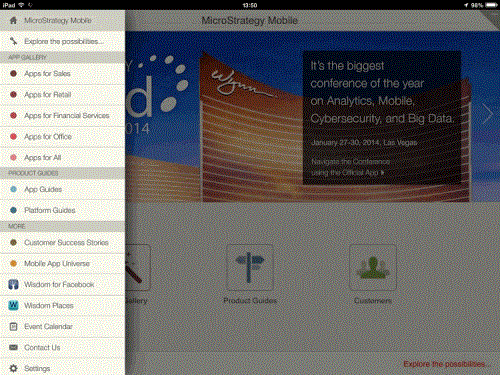
You can also use an Information Window as a navigational menu that displays when a user clicks on a button in the page. For example, in the MicroStrategy Mobile demo app below, an Information Window is used to display a list of useful links within the app. The Information Window is configured to slide in from the left side of the screen when the user clicks a menu button in the app.
To use an Information Window in a document, you must do one of the following:
-
Define a panel stack to be used as the Information Window, and a Grid/Graph or selector that uses the panel stack as an Information Window, as described in To define an Information Window for a Grid/Graph or a selector in a mobile document.
-
Define a panel stack to be used as the Information Window, and a text field, image, or button that uses the panel stack as an Information Window, as described in To define an Information Window for a text field, an image, or a button in a mobile document.
You can specify how the Information Window is displayed, by specifying how it opens (for example, it can slide in from the right), how it closes (using a Close button or tapping outside the window), its location, and its opacity. For examples of the different options and steps to specify them, see Specifying the display of an Information Window on an iPad or iPhone.
To define an Information Window for a Grid/Graph or a selector in a mobile document
-
In MicroStrategy Web, navigate to the document to add an Information Window to. The document must contain a Grid/Graph or a selector, which must contain data related to the data to be placed on the panel stack. This procedure includes steps to add a selector.
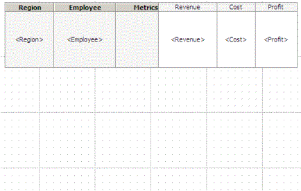
For example, the document shown below contains a basic grid:
-
Open the document in Design Mode.
To define the panel stack for the Information Window
-
From the Insert menu, choose Panel Stack. When you move the cursor into the Layout area, the pointer becomes a crosshair.
-
Click and drag anywhere in the Layout area to create the panel stack. The panel stack is added to the document.
-
Right-click the panel stack, and select Properties and Formatting. The Properties and Formatting dialog box opens.
-
From the left, click General, then type an appropriate name for the panel stack in the Name field. This name appears as the title of the Information Window on the mobile device.
-
Select the Use as Information Window check box.
-
Click OK to save the changes.
-
Add data related to the Grid/Graph to the Grid/Graph or selector.
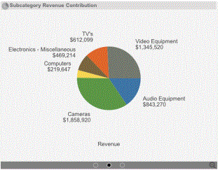
For example, in the document above, a pie chart representation of Revenue for each Year is added to the panel stack, as shown below:

-
Do one of the following:
-
If you are using a Grid/Graph, define the Grid/Graph as a selector. Follow the steps below:
-
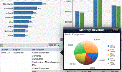
In the report grid, right-click the attribute you want to use as the selector, and choose Use as Selector. MicroStrategy Web automatically attempts to find targets for the selector.
In the above example, the Region attribute is used as a selector for the Information Window.
-
To verify that the selector targets the Information Window, right-click the attribute again, and choose Edit Selector. The Configure Selector dialog box appears, as shown below.
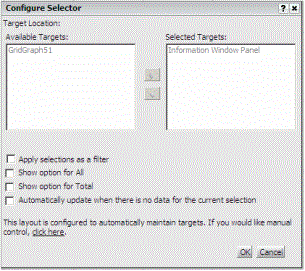
-
In the Selected Targets list, ensure that the Information Window panel appears in the list.
-
Click OK.
-
-
If you are using a selector, create the selector to target the panel used as an Information Window. Follow the steps below:
-
Click the arrow next to the Selector Control icon
 on the Controls toolbar, and then choose how to display the selector from the drop-down list. When you move the mouse to the layout area, the pointer becomes crosshairs.
 -
Click the section of the Layout area in which to place the selector. If you click and drag in the section, you can size the selector.
-
Right-click the selector and select Properties and Formatting. The Properties and Formatting dialog box opens.
-
From the left, choose Selector.
-
Select an attribute, custom group, or consolidation in the Source field. The elements of the source are displayed as items in the selector.
-
In the Selected list, ensure that the Information Window panel appears in the list.
-
Click OK.
-
-
-
Save the document.
For the example above, when the document is executed on an iPad, the Information Window appears when the user taps an element in the Region column, as shown below:

To define an Information Window for a text field, an image, or a button in a mobile document
To create the panel stack for the Information Window
-
In MicroStrategy Web, navigate to the document to add an Information Window to.
-
Open the document in Design Mode.
-
From the Insert menu, choose Panel Stack. When you move the cursor into the Layout area, the pointer becomes a crosshair.
-
Click and drag anywhere in the Layout area to create the panel stack. The panel stack is added to the document.
-
Right-click the panel stack, and select Properties and Formatting. The Properties and Formatting dialog box opens.
-
From the left, click General, then type an appropriate name for the panel stack in the Name field. This name appears as the title of the Information Window on the mobile device.
-
Click OK to save the changes.
-
Add controls to the panel stack, such as Grid/Graphs or text fields.
To define the text field, image, or button that uses the Information Window
-
In MicroStrategy Web, navigate to the document to add an Information Window to.
-
Open the document in Design Mode.
-
Add a text field, image, or button to the panel stack.
-
Right-click the text field or image, and select Properties and Formatting. The Properties and Formatting dialog box opens.
-
From the left, click General.
-
From the Panel Stack drop-down list, select the panel stack to use as the Information Window.
-
Click OK to save your changes.
-
Save the document.
Specifying the display of an Information Window on an iPad or iPhone
You can specify how an Information Window opens on an iPad or iPhone: by popping up over the document, flipping up (like turning over a card), increasing in size, or sliding in from an edge of the screen.
You can display a Close button on the Information Window or have it close when the user taps outside the Information Window.
An Information Window can display in the best position automatically, at the position of the panel stack, above or below the selected object, or to the right or left of the selected object.
You can specify the transparency of the Information Window.
You specify these options by defining:
-
The window Mode, which is how the Information Window opens (pop up, flip up, scale, or slide)
-
Whether the Close button is displayed
For pop-up Information Windows, you can specify the placement, or position, of the Information Window.
-
A flip-up or scaling Information Window displays in the center of the screen.
-
A sliding Information Window displays at the edge that it slid from.
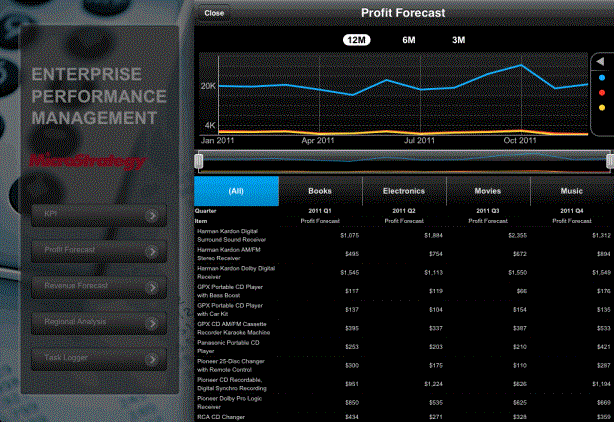
In the document below, a user can tap the buttons on the left to display Information Windows.

Each Information Window is formatted differently. If a user taps the KPI button, an Information Window without a Close button pops up. The user can tap anywhere outside of the Information Window to close it.

If the user taps the Task Logger button, the Task Logger Information Window pops up. Notice that a Close button is displayed.
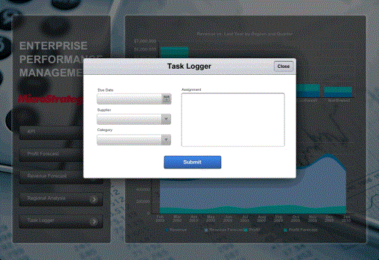
When the user taps the Profit Forecast button, the Profit Forecast Information Window slides in from the right.
To specify how an Information Window displays on iPads and iPhones
-
In Web, open the document in Design Mode.
-
Right-click the panel stack that is used as an Information Window, and select Properties and Formatting.
-
From the left, choose the General category.
-
To specify how to open the Information Window, select one of the following Window mode options:
-
To open the Information Window by popping it up, select Appear. (This is the default.)
-
To open the Information Window by flipping it up, like turning over a card, select Flip Up.
-
To open the Information Window by gradually increasing its size, select Scale Up.
-
To open the Information Window by sliding it from an edge of the screen, select Slide.
-
-
If you selected Appear as the Window Mode, you can specify the location of the Information Window. Select one of the following options from the Placement drop-down list:
-
To display the Information Window in the best position, select Automatic. (This is the default.)
-
To display the Information Window at the position of the panel stack, select Fixed.
-
To display the Information Window above the selected object (for example, the item in the selector or the attribute in the grid), select Above.
-
To display the Information Window below the selected object, select Below.
-
To display the Information Window to the left of the selected object, select Left.
-
To display the Information Window to the right of the selected object, select Right.
-
-
If you selected Slide as the Window Mode, you can specify which edge to slide the Information Window from. Select one of the following options from the Position drop-down list:
-
Right (the default)
-
Left
-
Above
-
Below
-
-
By default, Information Windows on an iPhone fill the screen when they display. To scale the Information Window so it is the same size on the iPhone as in Web, select the Display in partial screen per panel stack size on mobile phone check box.
Information Windows on an iPad automatically scale so they are the same size as in Web.
-
If you selected Slide as the Window Mode, you can specify how much of the Information Window initially displays. Users can then drag the Information Window out to view the rest of the Information Window. Do one of the following:
-
If you selected Right or Left as the Information Window's position, specify how much of the Information Window's left or right side displays, respectively. Type the value, in inches, in the Initial sliding in width field.
To display the full Information Window, type
0(default). -
If you selected Above or Below as the Information Window's position, specify how much of the Information Window's bottom or top side displays, respectively. Type the value, in inches, in the Initial sliding in height field.
To display the full Information Window, type
0(default).
-
-
-
By default, the Information Window is closed when a user taps outside of the Information Window. To close the Information Window by tapping a button instead, select the Dismiss only when 'Close' button is tapped check box.
-
If the Information Window is set to open by flipping, increasing in size, or sliding into the screen, you can define how transparent the Information Window displays. Do the following:
-
From the left, select Effects.
-
In the Transparency field, type a percentage. A higher value displays the Information Window as more transparent, while a lower value displays the Information Window as more solid. The default value is
0. -
To blur the sections of the document that show through the transparent Information Window, select Enable blur effect.
-
-
Click OK to save your changes and return to the document.
Resetting panel stacks when selectors are changed
In documents for iPad, you can determine whether a panel stack resets to the first panel when an attribute selector that targets the panel stack is changed. By default, the current panel (the panel that is displayed) does not change when an attribute selector is changed. The steps to enable this option follow.
To determine whether a panel stack resets when a selector is changed
-
In MicroStrategy Web, open the document in Design Mode.
-
Right-click the panel stack, and select Properties and Formatting.
-
In the General category, select the Reset to first panel when targeted (Mobile only) check box.
-
Click OK to save your changes.