MicroStrategy ONE
Display Styles for Prompts in MicroStrategy Web
The type of prompt determines which display styles are available, as listed in the following table:
|
Display Style |
Available for |
|
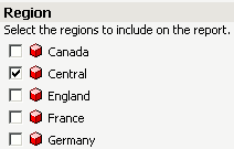
Check box
|
Attribute element list prompts Object prompts |
|
List
|
Attribute element list prompts Attribute qualification prompts Metric qualification prompts Object prompts |
|
Pull down
|
Attribute element list prompts Attribute qualification prompts Metric qualification prompts Object prompts |
|
Radio button
|
Attribute element list prompts Attribute qualification prompts Metric qualification prompts Object prompts |
|
Shopping cart
|
Attribute element list prompts Attribute qualification prompts Hierarchy prompts Metric qualification prompts Object prompts In MicroStrategy Web, a user clicks an object to drill to the next level. The user hovers overs an object to highlight it, then double-clicks in the highlighted area to add the object to the Selected list. |
|
Text box
|
Attribute qualification prompts Metric qualification prompts Value prompts |
|
|
Hierarchy prompts In MicroStrategy Web, a user expands the levels to navigate to an object. The user double-clicks an object to add it to the Selected list. |


Custom Prompt Styles for MicroStrategy Web
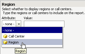
MicroStrategy provides a wide array of prompt styles out of the box, and you can add custom prompt styles to suit your needs. You can use any custom prompt styles that your project contains. To use a custom prompt style, select the Display Style associated with the custom prompt style. Next, select the custom prompt style from the Custom Style drop-down list.
Defining How Prompts Are Displayed in MicroStrategy Web: Style Settings
All the style settings for determining how prompts are displayed in MicroStrategy Web are described below. The type of prompt and the display style determine which style settings are available.
- Allow modification of the logical operator: Specifies whether the user, when the prompt is executed, can change the logical operator (AND, OR, and so on) of a qualification.
If Allow modification is selected, select one of the following options:
- Use a single logical operator between all conditions: The user can select only one logical operator to join all the conditions of the prompt qualification.
- Allow the user to set independent logical operators between conditions: The user can select different logical operators between each condition of the prompt qualification.
- Allow navigation above the search root: Specifies whether a user, when the prompt is executed, can navigate the hierarchy path above the search root, as described below:
- For a prompt that uses a search object in the prompt definition, the search root is the directory specified in the Look in field for the search.
- For a prompt that does not use a search object but allows a search (the Show search box option is enabled), the search root is the project directory, for example,
\MicroStrategy Tutorial. - Allow the user to browse elements in a qualification: Specifies whether a user, when the prompt is executed, can expand an attribute to select elements to answer the prompt.
- Height: If List height mode is set to Fixed, specifies the height of the list. If List height mode is set to Automatically, this setting is unavailable.
- Items per column/row: Defines the number of items to display in a column/row of the check box or radio button list.
- List height mode: Defines whether the height of the list is either:
- Automatically adjusted to the height of the list's contents.
- Fixed at the height specified in the Height field.
- List width mode: Defines whether the width of the list is either:
- Automatically adjusted to the width of the list's contents.
- Fixed at the width specified in the Width field.
- Orientation: Specifies whether the check boxes or radio buttons are Horizontal (displayed on a single line from left to right) or Vertical (displayed in a single column).
- Show search box: Determines whether a search of possible prompt answers is allowed when the prompt is executed. Allowing searches is useful if the prompt contains many possible answers. It provides users who know what they want a quick way to find it, while those who do not can scroll through the list until they find what they want.
The Show search box option is available for:
- Attribute element list prompts that list all elements of the attribute
- Attribute qualification prompts and metric qualification prompts that use search objects (for all display styles except Text Box)
- Hierarchy prompts
- Object prompts that use search objects (for all display styles)
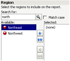
For example, an attribute element list prompt lists regions. When the prompt is executed, a user can select from the list of regions, or type "north" in the search box to display only Northeast and Northwest in the list, as shown below:
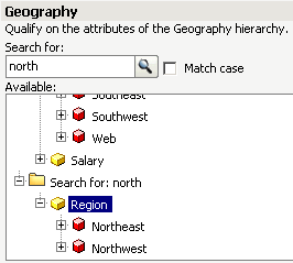
For a hierarchy prompt, the search box is not enabled until the user selects an attribute. In the example shown below, the user selected Region, the search box was enabled, and the user typed "north". The search results are displayed at the bottom of the hierarchy list.
If the prompt is based on a search that contains a string, the search box is disabled when the prompt is executed.
-
Require search: (Available only for hierarchy prompts) Determines whether the user must specify a search when he is browsing elements in a hierarchy prompt. If a search is not required, the elements are listed in the prompt. A search is useful if long lists of elements are possible. For example, a prompt displays the attributes from the Geography hierarchy. When an attribute is clicked, the attribute elements are listed (for an example, see the Tree example on click here). If a search is required, a search box is displayed instead of the attribute elements, as shown below:

You must enable Show search box for the Require search check box to become available.
- Width mode: Defines whether the width of the text box or pull-down list is either:
- Automatically adjusted to the width of the list or text box contents
- Fixed at the width specified in the Width field
- Width: If List width mode or Width mode is set to Fixed, specifies the width of the list or text box. If List width mode or Width mode is set to Auto, this setting is unavailable.