MicroStrategy ONE
Applying thresholds to a graph report
Individual cell data can be automatically formatted differently than the data in the rest of the report. Data that is formatted differently calls attention to itself, and makes that data easier to locate for analysis. This conditional formatting is called a threshold, because when a given value in your data reaches a certain point, or threshold, the conditional formatting is applied.
Thresholds are described in detail in Applying thresholds.
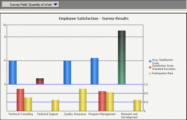
Enabling the display of thresholds on a graph report allows the conditional formatting to be applied to the series of a graph report, thus highlighting data of particular importance on the graph. The graph report shown below uses thresholds to highlight when employee satisfaction is above seven or below three for a given survey field.

In the report shown above, gradients are used to highlight each threshold on the Avg. Satisfaction Score metric. These two thresholds help to distinguish when employee satisfaction is considerably high or low.
While a gradient is used to display the threshold in the graph shown above, any background effect can be used for the threshold. This includes a solid color, a pattern, and any other available background effects. However, threshold formatting other than background effects cannot be applied to the graph report. For example, symbols and text formatting cannot be applied to the series of a graph. Therefore:
-
If a threshold does not include any background formatting, the threshold formatting cannot be displayed on a graph report.
-
If a threshold includes background formatting as well as other types of formatting, only the background formatting can be displayed on the graph report.
Not all graph types can display thresholds. For example, Area graphs combine all data into a single area object. Since the data is all visually connected into the same area object, thresholds cannot be displayed for specific data points. However, many graph types display a separate series or data marker for each data point, and thus can display thresholds.
The following graph types can display thresholds directly on the series of the graph:
-
Bar
-
Boxplot
-
Bubble chart
-
Funnel
-
Histogram
-
Pareto chart
-
Pie chart
-
Stock
The following graph types can display thresholds on the data markers that highlight specific data points on the series of the graph:
-
Gauge
-
Line
-
Polar chart
-
Radar line chart
-
Scatter plot and three-dimensional scatter plot
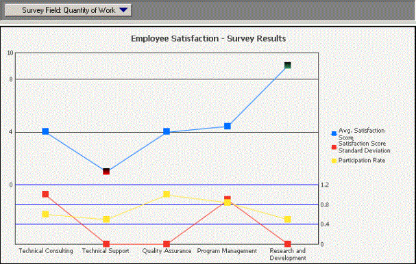
For example, the graph report shown below is the same report used in the previous example. However, the report shown below uses a Line graph style, and the threshold is applied to the data markers.

To apply thresholds to a graph report
-
Open a graph report. (How?)
-
From the Data menu, select Thresholds. The Thresholds dialog box opens.
-
If this is the first threshold on the report, a blank threshold labeled "New Threshold" is displayed. If not, click Add a new threshold in the toolbar.
Any thresholds that are already defined for this metric are displayed below the toolbar. If you want, you can select any existing threshold to modify, and then skip defining the condition, as described in this step. An existing threshold must include some type of background formatting such as a solid color, a gradient, or a pattern. The background formatting is the only conditional formatting that is displayed on a graph report.
-
You can rename the new threshold by selecting New Threshold and entering the new name.
-
Define the condition that the value must meet to have the threshold formatting applied. Click the text Click here to start a new qualification. (A qualification can be "Region In list {Northeast, Mid-Atlantic, Southeast}" or "Profit Greater than 10000", for example.) Field, Operator, and Value replace the text, and they must each be defined:
-
Click Field to select the business attribute or metric calculation that is part of your condition. The list includes all the attributes and metrics on the report. You can also click Rank or Percent, and then select a metric.
-
Click Operator to select an operator, such as Exactly, Greater than, or In List. The operators available for selection depend on whether you selected an attribute or a metric as the Field.
-
Click Value to select a value. Depending on the Field and Operator chosen, Value can be any of the following:
-
Type a value. Enter a number to compare the Field to.
-
Select Elements. Select the attribute elements to compare the Field to.
-
A list of the attributes on the report. Select the attribute form to compare the Field to.
-
A list of the metrics on the report. Select the metric to compare the Field to.
-
Field, Operator, and Value, if you selected Where as the Operator.
-
If you selected Is Null or Is Not Null as the Operator, Value is not available.
-
If you selected Between or Not Between for the Operator, you must select two values.
-
If you selected an existing threshold instead of creating a new one, you do not have to redefine the condition.
-
-
To specify a second qualification for the same threshold, click the text Click here to start a new qualification, and then begin again at step 5. By default, the logical operator joining the qualifications is AND. To change it, click AND then select the new operator from the drop-down list.
-
Next, you define the formatting that you want displayed for values that meet the condition you have defined above.
-
Click Edit the threshold formatting on the toolbar. The Format Cells dialog box opens.
-
Click the Background tab.
-
Select a Background style from the drop-down list, and then choose the colors to use. For more detailed instructions, see Format the background.
To apply a background to a graph report, you must select a Background Style other than Default.
-
Click OK to close the Format Cells dialog box. A preview of the selected formatting is displayed.
-
-
Select the threshold that you formatted, and click Enable threshold on Graph
 on the toolbar. This applies the background color to the graph when the threshold condition is satisfied.
This icon is available only when you have formatted the background of the selected threshold.
-
Click OK to save the threshold definition and close the Thresholds dialog box. Your new threshold is automatically applied.
-
From the View menu, select Graph View. The report is displayed as a graph.
-
Review the graph report. The thresholds should be displayed for applicable data on the graph report.
-
If you are using one of the graph types that support thresholds, and you do not see thresholds on the graph report, use the steps provided below to display the thresholds:
-
From the Graph menu, select Preferences. The Preferences dialog box opens with the Options - General page displayed.
-
In the Other area, clear the Apply rounded effects to all series check box. This removes the automatic beveling effects used for the series and data markers of the graph report, but it also allows the display of thresholds for certain graph types. You can still apply and create your own custom bevel effects for the graph report, as described in Formatting the series in a graph report.
-
Click OK to save your changes and return to the graph report. The thresholds should now be displayed on the graph report.
-
