MicroStrategy ONE
Widgets for mobile devices
A widget is a Flash-based display of the results of a report, allowing users to visualize data in different ways than traditional reports do. Widgets are sophisticated visualization techniques that can combine with rich interactivity to enable users to understand their data more effectively.
You can define a Grid/Graph to display as a widget on a document when the document is executed on a mobile device that has the MicroStrategy Mobile application.
You can also define a report to display as a widget when the report is executed on a mobile device that has the MicroStrategy Mobile application. You use MicroStrategy Web to create these widgets; for instructions and more information, see the MicroStrategy Mobile Analysis Help.
The following widgets can be displayed on mobile devices with MicroStrategy Mobile:
-
Data Cloud widget, which displays attribute elements in various sizes to depict the differences in metric values between the element
-
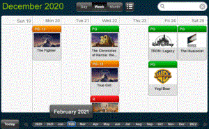
Date Selection widget, which displays an interactive event calendar. Users can:
-
Display a list of events in the calendar by month, week, and day
-
Display events using different colored headers based on the event category that they belong to
-
Search for events
-
You can display events in the calendar using different colors depending on the event's category. For example, release dates for movies are displayed in the calendar, and the movies are divided into categories based on the rating of the movie. You can display movies rated PG in green, movies rated in PG-13 in yellow, and movies rated R in red, as shown below:

-
-
Graph Matrix widget, which displays the data in a chart containing one graph for every combination of the data that you specify, allowing users to examine the data for each combination individually
To create a Graph Matrix widget, create a Visual Insight (VI) dashboard with a Graph Matrix visualization, then convert the VI dashboard to a document. For instructions, see the MicroStrategy Web Help.
-
Heat Map widget, which displays data as a combination of colored rectangles, each representing an attribute element, that allow users to quickly grasp the state and impact of a large number of variables simultaneously
-
Image Viewer widget, which allows users to display images, view image descriptions, and zoom in and out of images. For example, you can display images uploaded by a Photo Uploader widget, or images stored in a public location.
-
Interactive Grid widget, which displays data in a compact tabular layout. Attributes and metric values are displayed in columns in the widget's grid, as shown below. If a column contains more than one metric, users can customize their display by changing the metric that is displayed in the column.

-
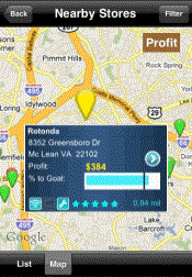
Map widget, which allows users to search and view information for locations on a map. Locations on the map are displayed using map markers when the widget is displayed on a mobile device. Selecting a map marker displays an Information Window with additional details about the selected location.
-
For example, in the image below, stores are displayed as markers in the Map widget. When a user selects a marker, an Information Window for the store is displayed, with the store's name, address, and distance from the current location of the user.

-
You can use static images as map markers in the widget, or display the map markers as dynamic bubbles. The size of each dynamic bubble is automatically determined based on the value of the metric on the columns of the widget, with the largest bubbles being displayed for the largest metric values.
-
-
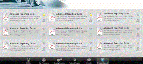
Multimedia widget, which allows users to browse and view files in a web folder, such as documents, images, and videos. When viewed on a mobile device, the Multimedia widget displays a list of available files in a grid layout, along with information about each file, including the file name, description, and file type. Users can tap the Download icon next to a file displayed in the widget to download and view the file. When the mobile device is offline, users can view files that have been downloaded and automatically stored on their mobile device. Files that have not been stored on the mobile device are greyed out and cannot be viewed offline.
-
Photo Uploader widget, which allows users to upload images from a mobile device. A user can choose to take a new image, use an existing image on their mobile device, or delete images.
-
RSS Reader widget, which displays and updates RSS (Really Simple Syndication) feeds
-
Timeline widget, which allows users to track changes in the status of multiple business assets, as well as important events affecting each asset. For example, a business owns multiple airplanes, which are leased out to different airlines. During the time that the company owns an airplane, the leasing status of the airplane can change. The airplane can be loaned to a different airline or kept on the ground without being used. Other events can occur in the lifetime of the asset, such as the airplane being sold or an airline choosing to extend its current lease on the airplane.
-
In the image below, each of the horizontal lines displayed in the timeline represents a different commercial jet. The lines are colored differently depending on their lease status. For example, periods in which planes are not currently leased are represented with a gray line. An icon is displayed along the line if an event has occurred to the airplane at a specific point in time, such as the airplane being sold, or the airplane being leased to a new company. There are metric values displayed at the bottom row of the widget, with a separate value displayed for each year, as well as metric values displayed in the rightmost column of the widget, with a separate value displayed for each asset.

-
-
Time Series widget, which displays data in a line graph over a specific period of time. You can configure the widget to display multiple data series on the same graph. For example, the values of the Deficit Rate of Change metric for the US and World over a six-month period are displayed in the image below.


For a complete list of the types of files that can be viewed on a Multimedia widget, see the MicroStrategy Web Help or the MicroStrategy Mobile Analysis Help.
All other widgets display as Grid/Graphs on mobile devices. For information on other widgets, see Providing Flash-based analysis and interactivity: Widgets.
For procedures to create these widgets, and a listing of the widget types that display on each type of mobile device, see the MicroStrategy Web Help or the MicroStrategy Mobile Analysis Help.
