Strategy One
Create a Time Series Visualization
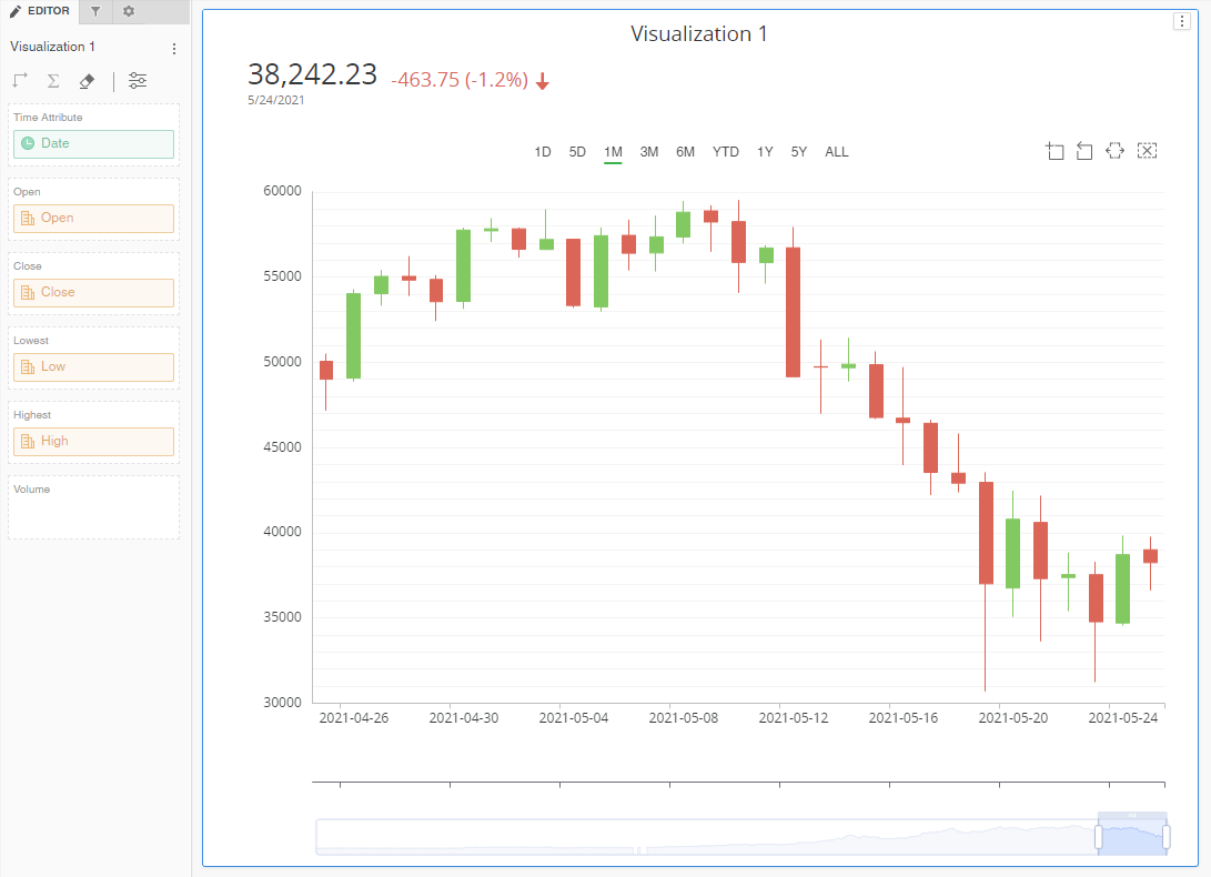
A time series visualization enables common financial and market analysis workflows, like stock and cryptocurrency. It is typically used to display one or more values that change over time, such as open, close, volume, high, low, and moving averages. These visualizations support long time ranges, commonly expanding several years. Therefore, there's a need to interactively change the time scale of the visualization, from days to weeks, years, and so on.
Time series visualizations allow analysts to change the time scale and freely scroll through data in a fluid fashion. A common setup is to have two visualizations, such as volume and price, with coordinated axes that scroll together.
Check out the video below to learn more!
- Open a dashboard.
-
In the top toolbar, click .
- Choose More > Time Series
 .
. - Add a minimum of at least one time attribute and one or more metrics. Your visualization appears as a line chart until you have added enough metrics for the candlestick display.
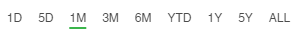
- Use the time selector to pick a relevant time period.
- Use the time slider to adjust the time range.
- Open the Format panel to select formatting options:
If you are using the Candle Chart visualization from the Strategy Community Gallery, you can easily convert it to a Time Series visualization using the Gallery.

- Color the KPI with positive and negative arrow colors
- Rename moving averages
- Enable x-axis labels
- Control axis and grid borders
- Enable banding