Strategy ONE
Customize the Login Screen for iOS
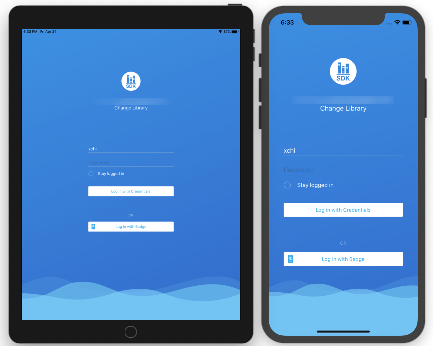
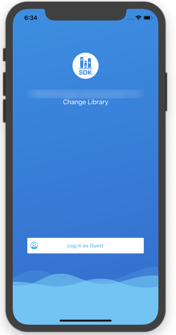
Library Mobile SDK for iOS allows users to easily customize the Login screen using properties in MSIUICustomizationSettings.plist, instead of writing custom code. Here are some examples of the customizations you can make by replacing the content in MSIUICustomizationSettings.plist with the corresponding .plist file shown below. See KB484291 for a demo of this functionality.
Changes that you make in the SDK take precedence over changes you make using the Application Appearance editor in Workstation. Customizations that you apply on the Library Screen using the SDK will not be affected. For more information, see Modify the Library Logo and Color Theme.
Enable Login screen customization
- Set up the environment to use the Library Mobile for iOS project. You are using this project as the basis for your customizations.
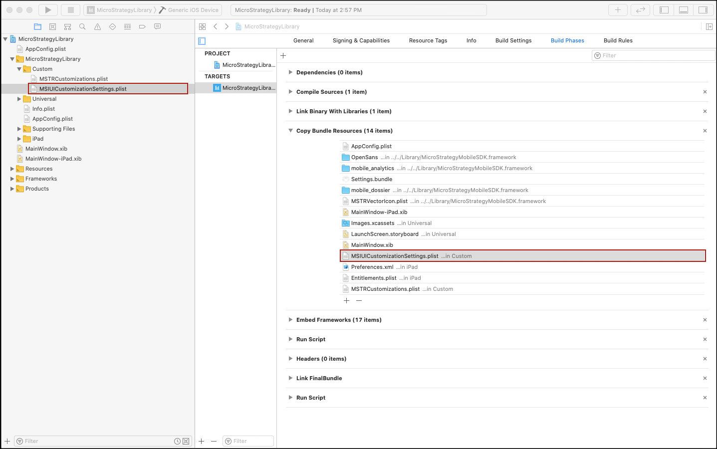
- MSIUICustomizationSettings.plist is used to customize the Login screen. This file is included in the template project. If it is not included, copy it to the main bundle in Project Settings > Build Phases as shown below. This property file is automatically read as long as it is found in the main bundle of the compiled application.
- Along with a demo .plist file, MicroStrategy provides three sample property files that correspond to the three different Login screen styles in Templates/Template/Custom. Replace the contents of MSIUICustomizationSettings.plist with one of these files to see how they work. A simple way to do this is to remove the sample MSIUICustomizationSettings.plist and rename the one you want to use as MSIUICustomizationSettings.plist.

Customization settings
Let's take a look at the customization settings inside the file. The root of MSIUICustomizationSettings.plist is a dictionary that holds configuration key-value pairs. Add your configuration to the root dictionary of the property list file to achieve the customization. An example .plist file is shown below.

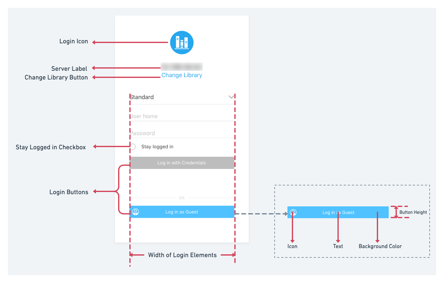
The diagram below shows the mapping between the .plist settings and the UI elements on the Login screen. For example, you can customize the login icon by modifying items in the LoginIcon dictionary in the .plist file.
LoginUI style
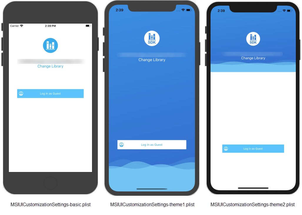
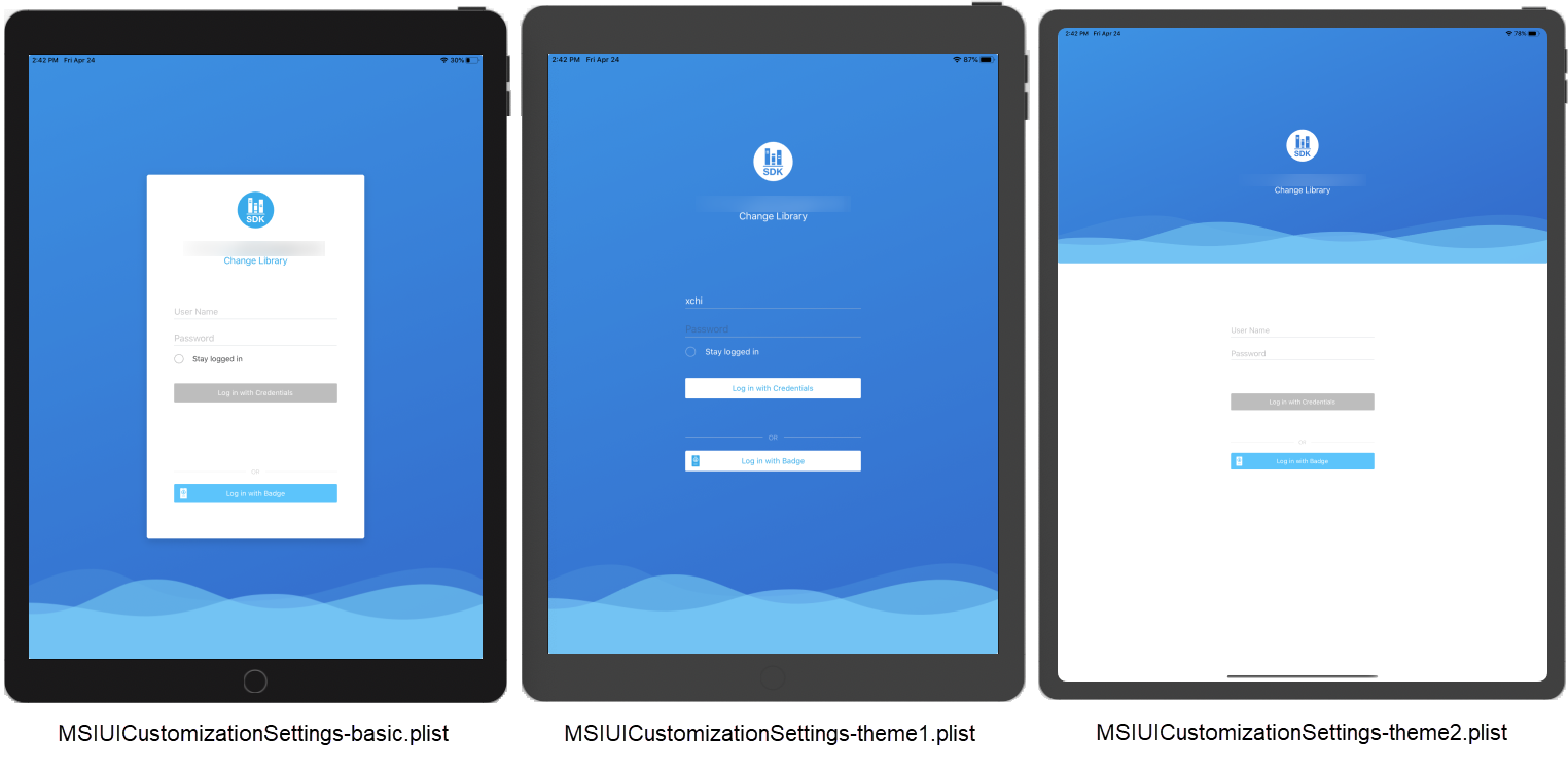
The Library Mobile SDK for iOS provides three login UI styles: basic, theme1, and theme2. These styles correspond to different view layouts by specifying the value of the LoginUIScreenStyle property.
|
Key |
Type |
Default Value |
|---|---|---|
| LoginUIScreenStyle | number |
0 - basic 1 - theme1 2 - theme2 |
Here is a contrast form for these three styles:
|
Name |
LoginUIScreenStyle |
Description |
||
|---|---|---|---|---|
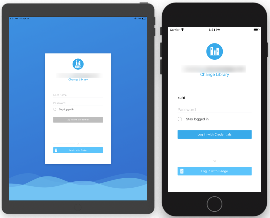
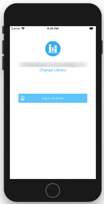
| basic | 0 | This is the default style. The login view is shown as a white card and the background is applied beneath the card. On iPhones, the card view fills up the entire screen, so no background is shown. |
|
|
|
theme1 |
1 |
The login view fills up the content view and the background is used in full. Use this style to specify a full screen background for the login screen. The position of the UI components and the padding between them is slightly different from the basic style. |
|
|
| theme2 | 2 | Similar to theme1, the login view fills up the content view. However, the background only applies to the top half of the login view, while a white background is used for the remaining bottom half. The layout of UI components is the same as theme1. |
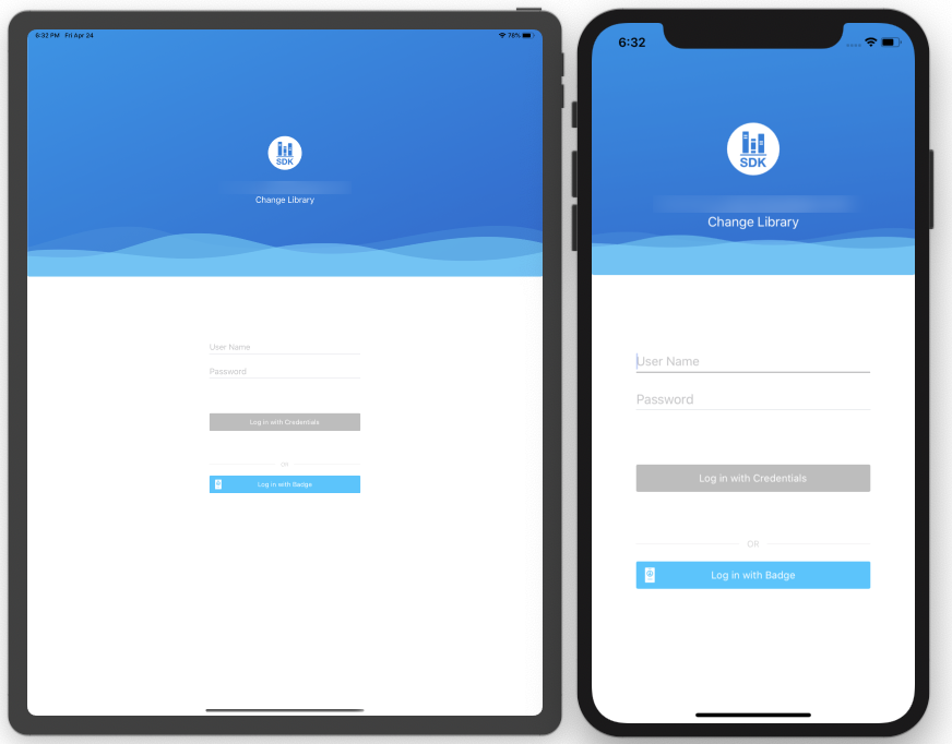
|
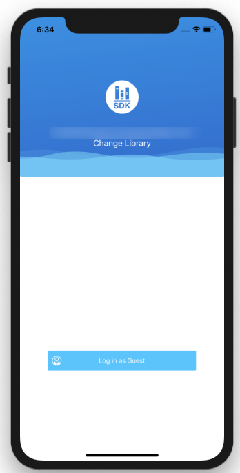
|
Background image
Set a custom background image using the BackgroundImage dictionary:

Adapt to devices with different screen aspect ratios
The screen aspect ratio is different across different devices. You may need to consider setting different screen-specific background images for different devices, since the background image is scaled to fit the current device. In iOS, you can set different background images for iPad landscape and portrait mode, iPhone X devices, and other iPhone devices.
|
Key |
Devices |
Type |
Suggested image |
|---|---|---|---|
| Landscape | Landscape background for all iPad devices | string* |
4:3 |
|
Portrait |
Portrait background for all iPad devices |
string* |
4:3 |
| IPhoneX | Background for the iPhoneX family | string* | 19.5:9 |
|
IPhone |
Background for other iPhones, besides the iPhoneX family |
string* |
16:9 |
*See Image resources for instructions to set an image as a string.
Image loading strategy for iPads
The table below details the image loading strategy for different combinations of landscape and portrait keys when using an iPad.
|
Landscape Key Exist? |
Portrait Key Exist? |
Landscape Background Image |
Portrait Background Image |
|---|---|---|---|
| ü | ü | Landscape | Portrait |
| ü | û | Landscape | Landscape |
| û | ü | nil | Portrait |
| û | û | nil | nil |
Image loading priority for iPhones
The table below details the image loading priority for different combinations of iPhoneX and iPhone keys when using an iPhone.
|
iPhoneX Key Exists? |
iPhone Key Exists? |
iPhoneX Background Image |
iPhone Background Image |
|---|---|---|---|
| ü | ü | iPhoneX | iPhone |
| ü | û | iPhoneX | nil |
| û | ü | iPhone | iPhone |
| û | û | nil | nil |
How to decide whether the current device belongs to the iPhoneX family
Get the hardware platform of the device, which is a string with the device model.
+ (NSString *)platform {
    size_t size;
    sysctlbyname("hw.machine", NULL, &size, NULL, 0);
    char *machine = calloc(size, sizeof(char));
    sysctlbyname("hw.machine", machine, &size, NULL, 0);
    NSString *platform = [NSString stringWithUTF8String:machine];
    free(machine);
    return platform;
}
As you can see from the code snippet below, two rules are applied to decide if a device is a member of the iPhoneX family.
- The platform string is one of the following:
- “iPhone10,3”
- “iPhone10,6”
- “iPhone11,2”
- “iPhone11,4”
- “iPhone11,6"
- “iPhone12,1”
- “iPhone12,3”
- “iPhone12,5”
- The ratio of screen width and height: if screen-width/screen-height <= 9/19.5.
+(BOOL)isDeviceiPhoneXFamily {
    NSString *platform = [MSIGeneric platform];
    if ([platform isEqualToString:@"iPhone10,3"] || [platform isEqualToString:@"iPhone10,6"])    return YES;
    if ([platform isEqualToString:@"iPhone11,8"])   return YES;
    if ([platform isEqualToString:@"iPhone11,2"])   return YES;
    if ([platform isEqualToString:@"iPhone11,4"] || [platform isEqualToString:@"iPhone11,6"])    return YES;
    if ([platform isEqualToString:@"iPhone12,1"])   return YES;
    if ([platform isEqualToString:@"iPhone12,3"])   return YES;
    if ([platform isEqualToString:@"iPhone12,5"])   return YES;
    if([[UIScreen mainScreen] bounds].size.width / [[UIScreen mainScreen] bounds].size.height <= 0.462) {
        return YES;
    }
    return NO;
}
Background color
As an alternative to a background image, you can set a solid color background by using the BackgroundColor property.
|
Key |
Type |
|---|---|
| BackgroundColor | string* |
*See Color for instructions to set a color.
Theme color
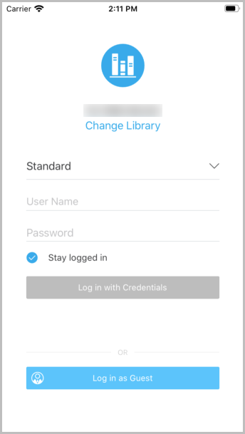
ThemeColor is a hex string that indicates the theme color used by the login view. If you want to color UI elements consistently, but don't want to set them individually, use this property.
|
Key |
Type |
|---|---|
| ThemeColor | string* |
*See Color for instructions to set a color.
The theme color that covers, but is not limited to the following UI elements:
- Background color of login buttons
- Tint color of the login icon
- Text color of the change server label
- Tint color of the Stay logged in checkbox
For example, the theme color of the login view shown below is #27A7EE. This is a general color setting that can be overwritten by specific settings for individual UI elements.
Default text color
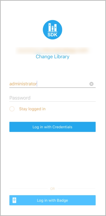
DefaultTextColor is a color hex string that indicates the default color of text in the login view.
|
Key |
Type |
|---|---|
| DefaultTextColor | string* |
*See Color for instructions to set a color.
The default text color covers, but is not limited to the following UI elements:
- Text color of text fields
- Text color of server label
For example, the default text color of the login view shown below is #E8A862. This is a general color setting that is that can be overwritten by specific settings of individual UI elements.
Width of Login buttons and text fields
MaxWidthOfLoginElements is used to specify the width of login elements, including login buttons and text fields. Even though you can increase the width of the login view by specifying MaxWidthOfLoginElements, there is always at least 30 pixels of padding between login elements and their outer boundaries.
|
Key |
Type |
|---|---|
| MaxWidthOfLoginElements | number |
Login icon
LoginIcon is a dictionary of key-value pairs storing properties of the login icon.
|
Key |
Type |
|---|---|
| LoginIcon | dictionary |
LoginIcon contains the following properties:
|
Properties of LoginIcon |
Type |
Description |
|---|---|---|
| Display | boolean | Determines whether the element is displayed or hidden. |
|
IconFont |
dictionary |
Specifies an icon from icon fonts. The size property is overwritten by IconSize. See IconFont for instructions to set an icon font. |
| IconImage | string | Specifies an icon using an image. See Image resources for instructions to set an image. |
|
IconSize |
number |
When greater than 0, specify the size of either IconFont or IconImage. |
An example of login icon customization is shown below.
![]()
![]()
Server label
ServerLabel is a dictionary of key-value pairs storing properties of the server label.
|
Key |
Type |
|---|---|
| ServerLabel | dictionary |
ServerLabel contains the following properties:
|
Properties of ServerLabel |
Type |
Description |
|---|---|---|
| Display | boolean | Determines whether the element is displayed or hidden. |
| Font | dictionary | Specifies the font for the label, including size and color. See Font for instructions to set a font. |
Change Library button
ChangeLibrary is a dictionary of key-value pairs storing properties of the Change Library button.
|
Key |
Type |
|---|---|
| ChangeLibrary | dictionary |
ChangeLibrary contains the following properties:
|
Properties of ChangeLibrary |
Type |
Description |
|---|---|---|
| Display | boolean | Determines whether the element is displayed or hidden. |
| Text | string | When not nul, custom text is given to the label. |
| Font | dictionary | Specifies the font for the label, including size and color. See Font for instructions to set a font. |
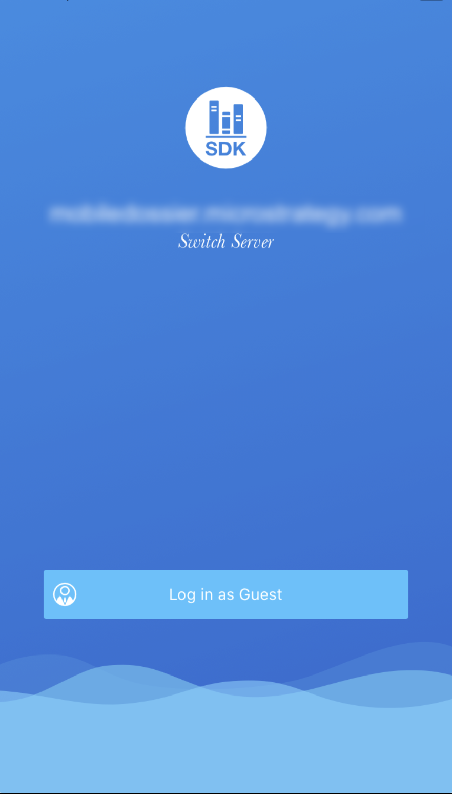
An example of the Change Library button customization is shown below.

Stay logged in checkbox
StayLoggedIn is a dictionary of key-value pairs storing properties of the Change Library label.
|
Key |
Type |
|---|---|
| StayLoggedIn | dictionary |
StayLoggedIn contains the following properties:
|
Properties of StayLoggedIn |
Type |
Description |
|---|---|---|
| Display | boolean | Determines whether the element is displayed or hidden. |
| StayLoggedInByDefault | boolean | Specifies whether the Stay logged in option is enabled by default. |
| Text | string | When not null, a custom text is given to the label. |
|
Font |
dictionary |
Specifies the font for the label, including size and color. See Font for instructions to set a font. |
An example of the Stay logged in customization is shown below.

Customization of individual login buttons
LogInButton is an array containing customization of individual login buttons.
|
Key |
Type |
|---|---|
| LoginButton | array |
Each element of the LoginButton is a dictionary of key-value pairs storing the properties of the login button.
|
Properties of a Login Button |
Type |
Description |
|---|---|---|
| AuthType | number | Specifies which button you want to customize. |
| Text | string | When not null, gives custom text to the button. |
| TextFont | dictionary | Specifies the font for the button text, including size and color. See Font for instruction to set a font. |
| IconFont | dictionary | When the login button contains an icon, this property customizes the icon from icon fonts. See IconFont for instruction to set an icon font. |
| BackgroundColor | string | Specifies the color of the button background. See Color for instructions to set a color. |
|
ButtonHeight |
number |
When greater than 0, this property specifies the height of the button. |
AuthType is an enumerate value that represents different types of login buttons.
|
Value of AuthType |
Login Button |
Default UI |
|---|---|---|
|
0 |
Badge |

|
| 1 | Standard/LDAP |

|
| 2 | Trusted |

|
| 3 | Kerberos |

|
| 4 | SAML |

|
| 5 | Guest |

|
| 6 | Basic Trusted |

|
An example of login button customization is shown below.


Data types
Besides some native data types like string, number, array, dictionary, and so on, you may see data types that are combinations of native data types in the .plist file when customizing UI elements. Here are some instructions for some important data types.
String
The string type is a basic data type that can represent image names, text strings, or color strings in the .plist file. If you add one item that is a string type, remember the default value is an empty string rather than a null value.
For example, if you add the Text property without giving it a specific value, it becomes an empty string. The same rule applies to other string type properties.

Number
The number type is a basic data type that can represent text size or button height in the .plist file. If you add one item with a key that is a number type, remember the default value is zero and it does not take effect unless it is greater than zero.
Image resources
Image resources are represented by a name string in the configuration .plist file, without a file extension. The actual resource should exist in the Images.xcassets project under the Universal folder.
Color
Colors are stored as case-insensitive hex strings that begin with #. The hex value should be a 6-digit RGB or 8-digit ARBG numeric value. The following strings are valid color hex strings:
- #ff6800
- #BA333333
Font
The Font property is used to customize the text style. It is stored as a dictionary with a font name, color, and size.
|
Key |
Type |
Description |
|---|---|---|
| Name | string | Name of the font that is available from either the iOS system or the project assets folder. No file extension is necessary. |
|
Color |
string |
Font color as a hex string. See Color for instructions to set a color. |
| Size | number | Font size in DP units. This setting is only effective when it is greater than zero. |
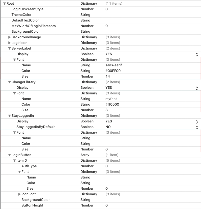
For example, you can modify the Font property to customize the text of the server label, Change Library button, Stay logged in checkbox, or login button title as shown below.
IconFont
IconFont is similar to Font and is stored as a dictionary with the following properties:
|
Key |
Type |
Description |
|---|---|---|
| Font | string | Same as the Name property of Font. The name of the font that is available from either the iOS or the project assets folder. No file extension is necessary. |
| FontString | string | The actual string for the icon. Normally a Unicode character represented as a hex string. |
| FontColor | color | Same as the Color property of Font. Font color as a hex string. |
|
FontSize |
number |
Same as Size property of Font. Font size in DP units. Only effective when it is greater than zero. |
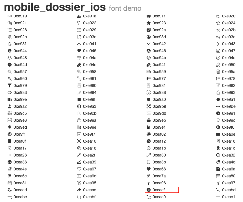
For example, you can modify the IconFont property to customize the login icon or login button icon as shown below.
![]()
As you can see from the above example, mobile_dossier_ios is the custom font, so you need to make sure the font file is copied to the main bundle in Project Settings > Build Phases.

Enter the expected font Unicode string in the FontString item without using '0xe' or '\u'. In the above example above, the "eaaf" font size is used.
Important points to consider
If no valid configurations are found for UI elements in the .plist file, the basic style loads for the UI elements. For example, if the Text key is not found for the ChangeLibrary dictionary, the default Change Library text is shown. If there is no ButtonHeight key found for button settings or the ButtonHeight is zero, the default button height of approximately 35px is used.

