MicroStrategy ONE
Linking from documents with buttons and tab bars
A button can send a user to the various screens, such as the Home screen or the Report List, on an iPad, iPhone, or Android device. A button can run a report or document, or open a web page or Information Window. An Information Window lets users view additional information in a pop-up window. In MicroStrategy Web, a button can open a web page, or run a report or document.
For example, the document shown below contains several buttons. Notice that all the buttons are displayed in white.

A button can change its appearance after a user taps it. When a user taps the Customer button, for example, the button changes to blue, as shown below. This is referred to as its highlight state. The button's initial state (when it is not selected) is referred to as its normal state.

A customer analysis document is displayed. If a user tapped the Sales Analysis button instead, a regional sales document is displayed. If a user taps the button with the envelope, the email program is launched.
The different button styles determine whether a caption, icon, or both are displayed. A caption is the text that describes the button's action. The icon is a small image that represents the button's action. If both a caption and an icon are displayed, the button style also determines where the caption and icon are located in relation to each other. The icon can be to the left or the right of the caption, or it can be above the caption.
You can also select the custom style, which allows you to select an image to display as the button. The image can be any shape, size, and color. The image is displayed on your mobile device without any additional formatting. You can use two different images, one for the normal state and the other for the highlighted state. The example above uses custom style buttons.
Each button can have more than one link. The same button can be linked to multiple web pages, reports, and documents. If a default link has been defined, that link is executed when the button is tapped. To open a list of links, tap and hold the button. If a default link has not been defined, tapping the button opens the list of links.
You can add a single button to a document, or add multiple buttons with different formatting in different locations on the document; see Creating a button to link from a Mobile document for steps. For documents displayed on an iOS device, you can create a bar of buttons that are all formatted the same, called a tab bar. A tab bar displays at the bottom of the screen, similar to tab bars in other iOS applications.
You create the tab bar as a navigation document, which contains only the tab bar. This allows the tab bar to display all the time, even when a user changes panel stacks or layouts on a document, or switches to a different document. In effect, you are creating a navigation system for the set of Mobile documents that are linked with the tab bar. The tab bar is shown only when navigating the documents linked in the tab bar. The tab bar is not displayed if either of the following cases:
-
A user opens a linked document from a folder, not from the navigation document or tab bar.
-
A user opens a document that is not linked in the tab bar.
The navigation document becomes the home page or launch site for this set of documents. When a user opens the navigation document, the tab bar and the document linked in the first button are displayed.
For example, a navigation document, called Store Dashboards, has been created for a project. The user opens Store Dashboards, and the Overview dashboard is displayed, along with the tab bar, as shown below:

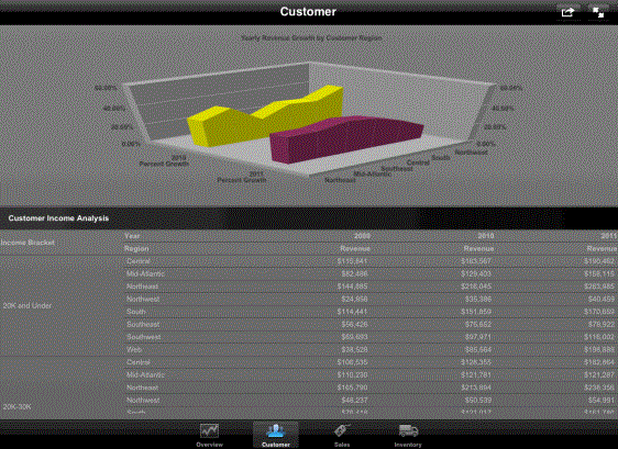
Notice that the button for Overview is selected in the tab bar. The user taps the button for Customer, which causes that document to display, as shown below:
Notice that the button for Customer is selected in the tab bar, and there is no Back button at the upper left.