MicroStrategy ONE
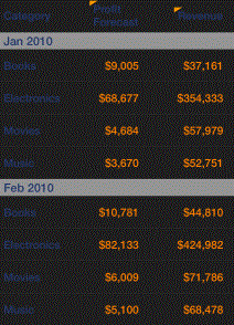
Displaying data in rows and columns: Interactive Grid widget
The Interactive Grid widget allows you to display data in a compact tabular layout on an iPhone, iPad, or Android device. Attributes and metric values are displayed in columns in the widget, as shown below. You can specify multiple display options for the widget, such as whether to apply banding to the rows in the widget, whether to display multiple attributes or metrics in a column as stacked together in a single row or allow users to toggle between the values displayed in the column, and so on.
You can allow users to directly edit the data displayed in the widget using a mobile device. For example, you create a widget to display a list of time off requests. A user can tap a button next to each request to display a check mark for approved requests and an X for rejected requests, then submit their changes to their data source. To accomplish this, you must link the widget's Grid/Graph to a Transaction Services report. For steps and background information about Transaction Services, see the Advanced Documents chapter in the Document Creation Help.
You can allow users to perform an action when they tap an attribute or metric in the widget on a mobile device. To do this, you must assign the action to the attribute or metric on the widget's Grid/Graph in Web. For example, if several customer regions are displayed in an Interactive Grid widget, you can allow users to tap the name of a customer region to update the data displayed in another grid in the document. Only one action can be performed for each attribute or metric. If more than one action is enabled for an attribute or metric, the action with the highest priority is performed. You can enable the following actions for a value in the widget, in order of highest to lowest priority:
-
Edit data for the attribute or metric, by displaying the attribute or metric as an input object control in a Transaction Services-enabled document.
-
Use an attribute or metric in the widget as a selector. To do this, you must define the attribute or metric as a selector on the widget's Grid/Graph.
-
Open a link to a report or document.
-
Drill on an attribute element.
The steps to add an Interactive Grid widget to a document follow.
For a Grid/Graph to be used as an Interactive Grid widget, it must meet the following requirements:
-
At least one attribute on the rows. The elements of this attribute are displayed in the first column of the widget.
-
At least one metric on the columns. The metric values are displayed in additional columns in the widget.
You can add objects from multiple datasets to the Grid/Graph containing the widget. You must have the correct privileges and the project must allow Grid/Graphs to use multiple datasets. For steps to allow Grid/Graphs to use multiple datasets, see the Adding Text and Data chapter of the Document Creation Guide.
To create and add an Interactive Grid widget to a document
-
Open the document in Design or Editable Mode.
-
From the Insert menu, point to Widgets, then Mobile, and select Interactive Grid.
-
Click the location on your document where you want to place the widget. The Grid/Graph containing the widget is displayed.
-
Optionally, resize the widget by clicking and then dragging its handles.
-
From the Dataset Objects panel on the left, select attributes and metrics, and drag them on to the Grid/Graph, as described in the prerequisites above.
Configure the widget's display properties
-
Right-click the widget, then select Properties and Formatting. The Properties and Formatting dialog box opens.
-
From the left, select Widget.
-
Click the Widget Properties icon
 . The Interactive Grid Properties dialog box opens.
 -
If you added more than one attribute to the widget, you can group the data displayed in the widget based on the first attribute in the widget's Grid/Graph. Do one of the following:
-
To group the data displayed in the widget, do the following:
-
Select the Apply Grouping to check box. The first attribute on the widget's Grid/Graph is automatically used to group the data when the widget is viewed.
-
You can change the background color used for the attribute elements in the grouping. From the Grouping background drop-down list, select the color you want to use as the background for the attribute elements. In the example image above, Grouping background is set to gray.
-
To remove the grouping background you applied, select No Fill.
-
You can change the font size used for the attribute elements in the grouping. From the Grouping Font Size drop-down list, select the size of the font you want to use. In the example image above, Grouping font size is set to 16.
-
To change the font size of the column headings, from the Header Font Size drop-down list, select the size of the font you want to use.
-
To change the font size of the data displayed in the Interactive Grid, from the Values Font Size drop-down list, select the font size you want to use.
-
-
To display the widget without grouping its data, clear the Apply grouping to check box.
-
-
From the Color Theme drop-down list, select a color theme to use to display the background color, border color, and header color of the widget.
-
By default, the rows of the widget are not banded. To apply banding to the widget, select the Banding check box.
-
By default, the width of the columns in the widget is automatically determined. To manually specify the width of each column, clear the Automatic column sizing check box. In the Width (%) fields, specify the width of each column as a percentage. The widths for all columns should add up to 100.
-
You can select a default action (such as drilling on an attribute, opening a report or document, or acting as a selector) to perform for attributes and metrics that have no action defined on the widget's Grid/Graph. From the Default Action Form drop-down list, select an attribute. The action defined for this attribute will automatically be performed when a user taps a value in the widget for which no action is explicitly defined.
It is recommended that you assign an action to only one attribute form in the widget. For example, if you want one attribute to act as a selector, ensure that drilling is disabled for the Grid/Graph, and that the attribute does not link to another report or document.
-
If you place multiple attributes or metrics in a column, you can choose whether to display each attribute element or metric value stacked together in a single row in the widget, or to allow the user to tap the header of a column to change which attribute or metric value is displayed. Do one of the following:
-
To allow users to tap a column header to change which object is displayed, select the Toggle check box.
-
To display each object as stacked values in a single row, clear the Toggle check box. Column headers are not displayed when values are displayed as stacked.
-
-
You can create, rearrange, or delete columns in the widget:
-
To rearrange report objects within the columns, click a report object and drag it to a new location.
-
To add a new column to the widget, click Add Column. The new column is added and displayed.
-
To delete a column, click
 to the right of the column.
The first two columns in the widget are added to the widget by default and cannot be deleted.
-
-
Click OK to return to the Properties and Formatting dialog box.
-
Click OK to save the changes.