MicroStrategy ONE
Dashboard-style Documents
Enterprise Manager comes with several Report Services documents that show one or more related reports in a dashboard-type display. Report Services documents are an excellent source of summarized data from related areas of analysis. Dashboards, which are a type of document, provide a lot of interactive graphical features to enable exploration of the data at several levels of detail.
The Enterprise Manager Overview dashboard provides an intuitive and interactive overview of collected document, report, and user activity data. It also serves as a quick guide to the other dashboards you can run in Enterprise Manager. Before executing any Enterprise Manager reports, use this dashboard to get an introduction to the capabilities of Enterprise Manager.
You must have MicroStrategy Report Services to view or work with a Report Services document. Dashboards must be viewed in MicroStrategy Web to take full advantage of their interactivity.
The other dashboards in Enterprise Manager are:
Except for the iPhone Analysis Dashboard, these dashboards are designed for use with MicroStrategy Web. If you are using MicroStrategy Web Universal, the links to other reports in the dashboards do not function. To correct the links, edit the dashboards and change all occurrences of Main.aspx in the links to mstrWeb.
Data Warehouse Optimization Advisor Dashboard
This dashboard provides information that can guide you when optimizing your data warehouse performance. The user specifies the time frame for analysis, the number of database tables to consider for optimization, and the percentage of jobs to consider in the optimization calculations.
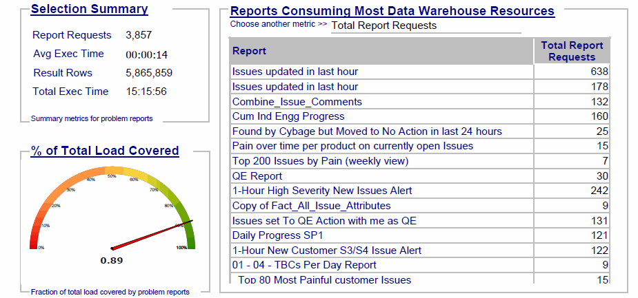
The top half of the dashboard summarizes the current database usage. This summary includes the following:
-
An executive summary of the database usage over the specified period, including the number of report requests and report result rows, the average execution time for each request, and the total execution time.
-
A gauge graph showing the percent of total database load that the specified percentage of jobs consume.
-
A grid showing which reports consume the most database resources. This grid can be sorted by number of report requests, number of result rows, or execution time.
The bottom half of the dashboard lists the database tables being considered for optimization. Clicking on a table brings up a list of optimizations and their potential effectiveness. These optimizations include aggregate table grouping and different types of secondary indexes.
Dashboard and Document Processing Analysis Dashboard
This dashboard provides an overview of document usage and performance in your projects, including average wait times and number of execution errors encountered. The user specifies the period for analysis.
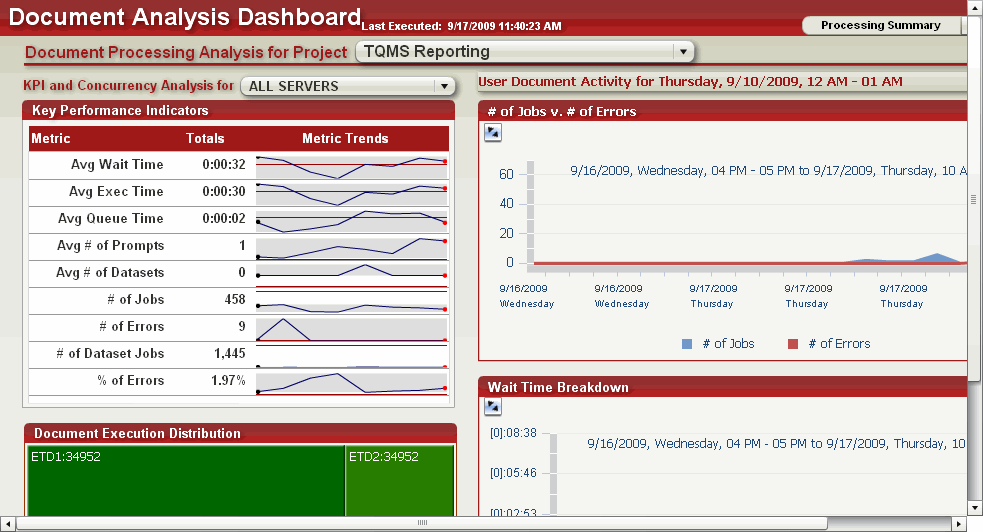
The Processing Summary area provides a general picture of document activity for a project and Intelligence Server. It includes the following:
-
Line graphs showing key performance indicators for document execution, including average wait times, execution times, and number of errors encountered
-
An area graph showing the number of jobs and execution errors over time
-
An area graph showing average wait, execution, and queue times for executed documents
The Document Details area provides in-depth information on documents in a project. Select a document from the drop-down list to view the following:
-
A bubble graph of popular documents, with the number of users and job requests for each document
-
General information about the selected document, including the owner, description, and date the document was last modified
-
An area graph showing the average wait time, execution time, and queue time encountered when executing the document
Mobile Usage and Adoption Dashboard
This interactive dashboard measures your MicroStrategy business intelligence system's use by mobile device users, and the overall contribution that Mobile usage contributes to the total business intelligence system use. This dashboard gives insight into details such as number of mobile interactive jobs, number of mobile subscriptions, and the most popular mobile reports and documents.
For an Enterprise Manager dashboard that is designed to be viewed on mobile devices, see Enterprise Manager Overview (For Phones) Dashboard.
You can specify the time frame for the reported data using the dashboard's prompt, and you can easily re-prompt the dashboard to change the time frame.
The left pane includes the following:
-
Intelligence Server Cluster: You can specify the cluster for which you want to report data.
-
Intelligence Server Machine: You can specify an Intelligence Server machine for which to report data.
-
Project: This pie chart shows which projects are most popular among mobile users. The grid report shows metrics for users, errors, and jobs.
The right pane includes the following tabs:
-
Mobile Contribution to Enterprise BI: Click this tab to view contribution of mobile usage to your overall system. You can see weekly subscription reports and weekly interactive reports. You can view total jobs, document jobs, and report jobs within the context of the respective weekly subscription or interactive reports.
-
Popular Reports and Documents: Click this tab to view a heat map showing the most popular reports and documents for your mobile users. Details are shown in a graph below the data.
Project Analysis Dashboard
This dashboard provides a comprehensive overview of usage and activity on your projects, over the time frame that you specify.
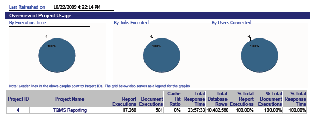
The top portion of the dashboard contains a general analysis of the system. It includes the following:
-
Pie charts showing the project usage by total time spent executing jobs, total number of jobs executed, and number of users connected
-
An overview of system usage for each project, including cache hits, number of jobs, and other metrics
On the dashboard, below the general analysis area is a separate portion for each project. These portions contain a detailed analysis of the project:
-
A line graph showing the weekly growth trend for the numbers of reports and other objects in the project
-
A line graph showing the weekly usage trend, in terms of number of users and number of user requests
-
A line graph showing the weekly project performance trend, in terms of job execution time and number of jobs
-
A graph showing the load distribution (ad hoc versus scheduled jobs)
This dashboard also contains links to other Enterprise Manager reports.
For customization purposes, the document links work over the ASP.NET version of MicroStrategy Web. For MicroStrategy Web Universal, the links must be modified appropriately. The MicroStrategy Developer Library (MSDL) provides information to customize Report Services documents.
Project Analysis (Interactive) Dashboard
This dashboard provides usage information for a project, including object storage, patterns in project growth, and a list of unused application objects for cleanup.

The Overview portion provides a general view of project performance and project size:
-
Line graphs of key performance indicators for the project over time, including the number of users, sessions, and document jobs
-
Bar graphs of the number of application and schema objects in the project, broken down by object type—reports, documents, attributes, and hierarchies
The Growth portion provides details about new application objects added to the project:
-
A graph of the number of application objects that have been added to the project by week, broken down by object type
-
A funnel graph of new application objects added to the project, organized by the owner of the object
The Usage portion provides a picture of the most frequently used objects in the project:
-
Heat maps of the top 10 frequently used reports and documents in the project
-
Lists of the top 10 attributes, metrics, and filters in the project
The Clean Up portion provides a view of unused objects in the project:
-
A list of unused reports, documents, attributes, and other application objects for the project
-
Links to generate scripts for deleting unused application objects from the metadata
Real-Time Server Usage Dashboard
This dashboard provides an overview of recent system activity. The user specifies the earliest date for which data is reported.
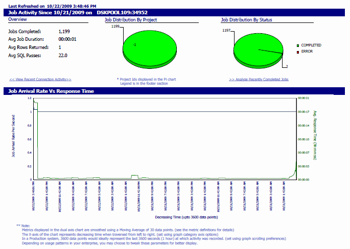
The dashboard includes the following:
-
Critical system metrics such as average job duration and total jobs processed for a given server machine
-
Pie charts indicating the recent job distribution by project, and execution status such as Completed, Error, and so on
-
A line graph showing system throughput and response time for a server machine
-
A grid indicating the status of scheduled jobs on the server machine, per project
The dashboard also includes links to more detailed reports.
For customization purposes, the document links work over the ASP.NET version of MicroStrategy Web. For MicroStrategy Web Universal, the links must be modified appropriately. The MicroStrategy Developer Library (MSDL) provides information to customize Report Services documents.
Report Usage Analysis Dashboard
This dashboard provides an overview of report usage and performance in your projects, including average wait times and number of execution errors encountered. The user specifies the period for analysis.
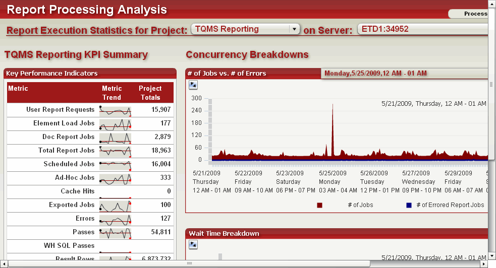
The Processing Summary portion provides a general picture of report activity for a given project and Intelligence Server:
-
Line graphs of various key performance indicators, including the number of user report requests, exported jobs, and execution times
-
An area graph showing the number of jobs and report execution errors encountered over time
-
A graph showing average wait times, execution times, and queue times for reports over time
The Reporting Details portion provides in-depth information on individual reports within a given project. Select a report from the drop-down list:
-
A bubble graph of popular reports, with the number of user and job requests for each report
-
Detailed information about the specified report, including the owner, description, and date the report was last modified
-
A heat map showing the users that have requested the report, along with the number of report execution errors encountered
Server Caching Optimization Advisor
This dashboard provides information that can guide you toward optimal caching strategies, according to historical usage data. The user specifies the percentage of jobs to be optimized (the default is 20%) and a period for the analysis.
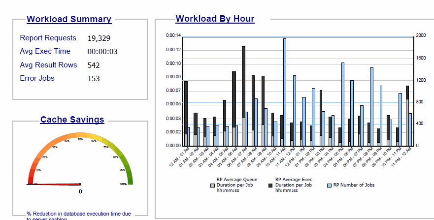
The dashboard has two panels. The first panel provides an overview of the effectiveness of server caching over the specified period:
-
A summary of the server workload, including the number of report requests, the average amount of time required to execute a request, the average number of result rows, and the number of jobs that resulted in an error
-
A gauge showing the percentage that database execution time has been reduced by jobs that hit the cache instead of the database
-
A bar graph analyzing the hourly server workload by average time each job spends in queue, average execution time per job, and number of jobs per hour
The second panel provides the optimization potential for three optimization strategies, presented in three grids:
-
Enabling caching for the worst-performing reports, according to projected database savings
-
Disabling caching for reports with low hit ratios
-
Increasing caching efficiency by building OLAP cubes augmented with frequently drilled-to objects
User Activity Dashboard
This dashboard provides an overview of user activity on an Intelligence Server or project, including statistics for report and document execution and user session information. You can also examine inactive users to determine how long they have been inactive or determine whether they should be removed.
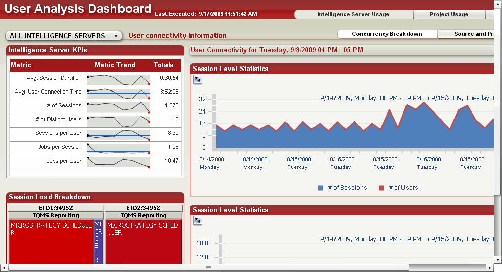
The Intelligence Server Usage portion shows user and session activity for an Intelligence Server:
-
Line graphs of key performance metrics for an Intelligence Server—average session duration, average connection time, and number of distinct users
-
A heat map showing the number of users connecting to Intelligence Server via applications such as MicroStrategy Web or MicroStrategy Scheduler
-
Area graphs with breakdowns of the number of sessions, number of users, and average session durations per application or project
The Project Usage portion contains user-specific activity information for a project. Select a project name from the drop-down list to view the following:
-
A heat map of connection activity by user with number of jobs and sessions per user and connection times
-
A breakdown of each user's individual activity, including the names of executed reports and documents, errors encountered, and wait times
The User Inactivity portion allows you to view information on inactive users by project or Intelligence Server:
-
An area map of inactivity trends showing the number of users that have been inactive for a given period
-
A list of inactive users, with a listing of account creation dates and date of last connection
-
A bar graph showing the distribution of inactive users by length of inactivity
Enterprise Manager Overview (For Phones) Dashboard
This dashboard provides MicroStrategy Mobile users with quick access to a high-level overview of activity in the MicroStrategy system in the past week. It is designed to be viewed in MicroStrategy Mobile. For an Enterprise Manager dashboard that provides information about mobile device usage in your MicroStrategy system, see Mobile Usage and Adoption Dashboard.
The main Enterprise Manager Mobile dashboard consists of links to four detailed dashboards:
-
The User Analysis dashboard provides information about user activity in the past week, such as the number of users who have connected to the MicroStrategy system, or the number of job requests logged. You can view user activity by interface, such as Developer, MicroStrategy Mobile, or MicroStrategy Web, by user group, or by feature, such as Report Services or OLAP Services.
-
The Project Analysis dashboard provides information about the reports and documents in each project that were used in the past week, and the load distribution across clustered Intelligence Servers for each project.
-
The Operations Analysis dashboard provides information about the number of report and document jobs that have returned an error in the past week. You can drill down to see which reports and documents returned an error, and what the error codes were for each report or document.
-
The Performance Analysis dashboard provides information about the past week of report and document requests from various sources, such as Developer, MicroStrategy Web, or Distribution Services. For each source, you can see how many reports/documents used a cache, how many used an Intelligent Cube, and how many used an external data source.
System Administration Overview Dashboard
The System Administration Overview dashboard provides system adoption and performance analysis of the MicroStrategy environment. The goal of this particular dashboard is to provide administrators with a quick look into the following aspects of their environment over the previous 2 months:
Below is a summary of each sheet of the dashboard, including the design workflow and intended goal.
Key Adoption and Performance Trends
The Key Adoption and Performance Trends sheet is titled "1. Trends"' and provides a high level snapshot of Key Performance Indicators (KPIs) in the MicroStrategy environment over the last two months. The purpose of this sheet is to provide a quick usage-based health check showing weekly KPI trends supported by a 2-month detail.
KPIs
Select a week from the top left selector. The top row of grids display KPI trends for the selected week compared to the week prior as indicated by an arrow (up/down/no change). The KPIs are:
-
Adoption
- Distinct Users
- Total Sessions
-
User Experience: Reports
- Report Jobs
- Report Elapsed Time
-
User Experience: Documents
- Document Jobs
- Document Elapsed Time
-
User Experience: Errors
- Report Errors
- Document Errors
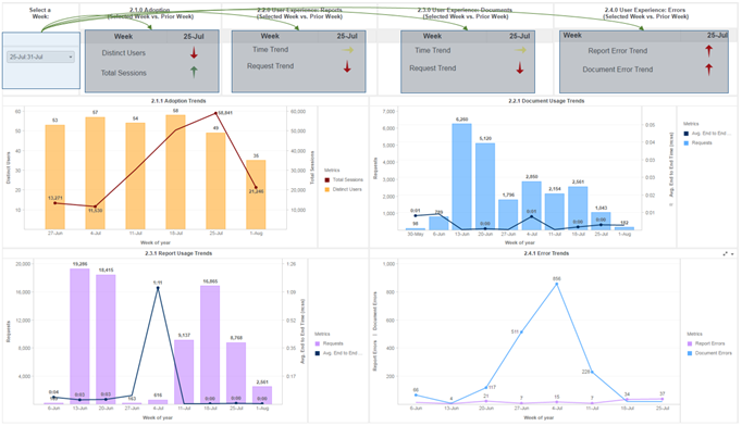
Each of these trend indicator grids correspond to a more detailed view of each KPI over time in the four combination charts directly below.
KPI Charts Over Time
This set of combination charts highlight the trends over the last two months of all KPIs utilized in the weekly trend comparison. The graphs are categorized as:
-
Adoption Trends
-
Document Usage Trends
-
Report Usage Trends
-
Error Trends
These charts are intended to provide a historical perspective to the KPI trend grids at the top, to understand if the trend you are seeing is indicative of a consistent trend in your environment or is the result of a system anomaly.
Peak Usage and Performance Analysis
The Peak Usage Analysis Sheet provides a high level view of hourly report usage metrics over the last two months.
Last Two Months Usage and Performance by Hour
Use this combination chart in the top of the dashboard to analyze the aggregate number of report jobs and the average report job elapsed time by hour of the day over the last two months. Interact with the elements within the graph to target the combination chart on the bottom, which provides details of report usage and performance by week during your selected time window over the last 2 months.
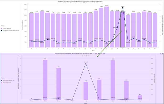
This ability to drill into a specific hourly time period is intended to provide administrators with the ability to determine whether high/low usage and performance metrics aggregated over the last two months are from consistent high/low usage over time or are skewed by usage and performance of specific weeks.
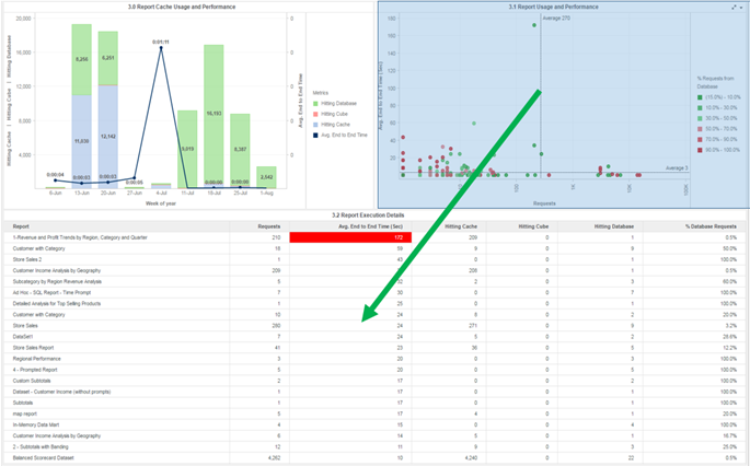
Report Usage and Performance Details
The Report Usage and Performance Details sheet is intended to provide administrators with the ability to dive into the individual report usage and performance details by a particular week. This empowers administrators to identify which reports in their environment pose a risk to both user adoption and system reliability due to poor performance.
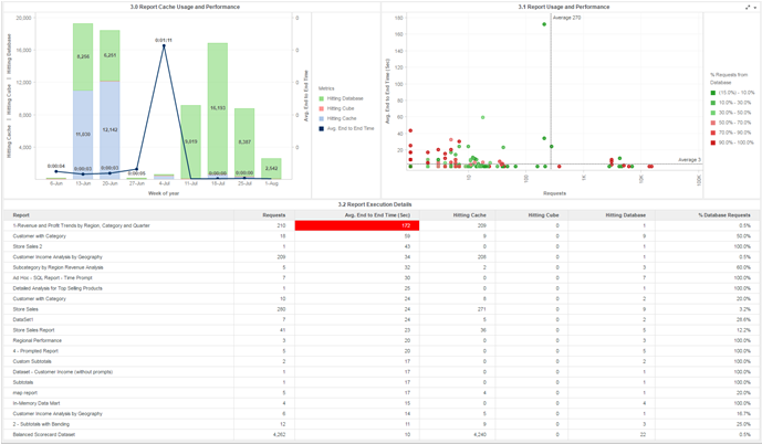
The combination chart in the top left is similar in design to the Report Usage and Performance chart provided within the Key Adoption and Performance Trends sheet of this dashboard. However, this chart provides the additional detail of breaking down the weekly report requests into whether each job was against a Cube, Cache, or Database. Administrators may interact with the elements of this chart to target the other two visualizations in the sheet.
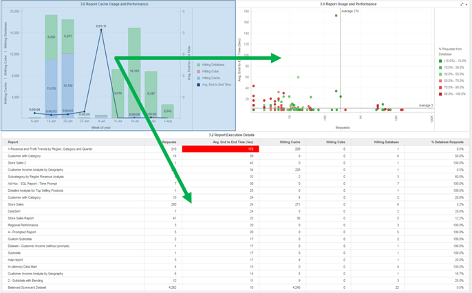
The top right visualization provides a scatter plot, with each point corresponding to a particular Report within your MicroStrategy environment. The x-axis is a logarithmic scale based on the total number of report requests during the selected time period, with the y-axis indicating the average end to end execution time of that report in seconds. Two reference lines are displayed, indicating the average number of report requests by report (vertical line) and average execution time (horizontal). As a result, the two quadrants of reports that should be analyzed are those that plot above the average execution time, especially those that have more than the average number of requests. Administrators can additionally select individual points on the graph or select points that fall within an area of the chart. This selection will target the grid at the bottom, which provides details such as the name of the report, the number of requests, and the breakdown of requests hitting cache/database/cubes.