Strategy ONE
Auto Narratives
Starting in MicroStrategy ONE (September 2024), auto narratives is supported in Managed Cloud Enterprise. You can use auto narratives in Strategy Library, Library for iOS, Library for Android, and Workstation when you connect to a Library server.
Auto narratives simplifies data interpretation by transforming complex visualizations into easy-to-understand natural language summaries. This enhances data accessibility, reduces the time needed to identify key insights, and makes data comprehensible to users of all technical backgrounds. Users can generate customizable summaries for entire dashboard pages or specific visualizations, ensuring relevance by respecting any filters applied. Narratives are updated when underlying data changes, maintaining accuracy and context. This supports faster decision making and caters to various user needs, from technical experts to non-technical stakeholders.
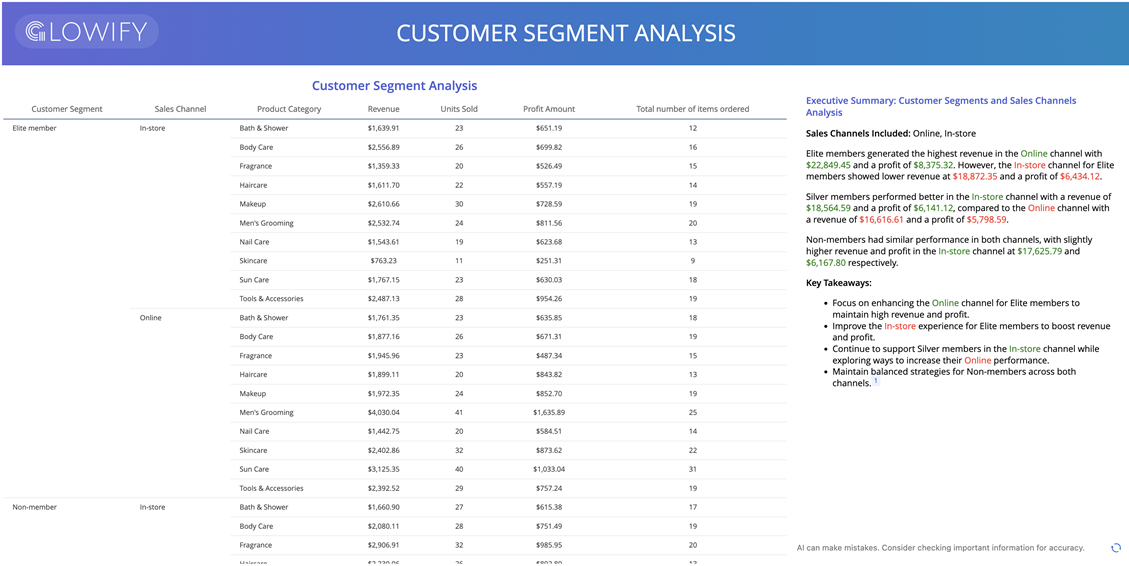
Starting in Strategy One (September 2025), you can display an AI-generated summary of an entire dashboard page using auto narratives. See Auto Narratives for Dashboard Pages: One-Click Page Summaries.
Prerequisites
Auto narratives is part of the Strategy AI add-on bundle and is available for Managed Cloud Enterprise (MCE) customers starting in MicroStrategy ONE (September 2024). Only users and user groups with the Use Auto Assistant and ML Visualizations privileges can access auto narratives.

Generate a Default Auto Narrative for a Visualization
Dashboard authors can create auto narratives. By creating an auto narrative directly from an existing visualization, a general summary of the visualization is created automatically. You do not need to provide any instructions. You can modify the summary to reflect an output that suits your business needs.
-
Edit a dashboard.
-
In the top right of an existing visualization, click More
 and choose Create Auto Narratives.
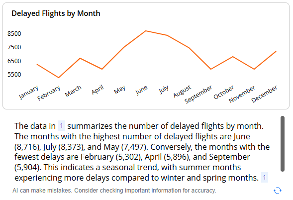
A general summary of the visualization displays in a new visualization, as shown below. The summary of the Delayed Flights by Month line graph lists the months with the highest and lowest number of delayed flights, with the insight that it's a seasonal trend.
-
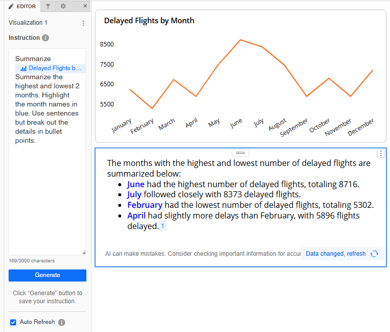
To modify the summary, select the auto narrative. On the Editor panel, describe your request in detail in the Instruction box. For example, you can add the following after the visualization tag:
Summarize the highest and lowest 2 months. Highlight the month names in blue. Use sentences but break out the details in bullet points.
-
Click Generate to refresh the auto narrative.
The results are shown below:
-
By default, the summary content is automatically refreshed when the data changes, for example, by changing a filter. To disable the automatic refresh, in the Editor panel, clear the Auto Refresh check box. When disabled:
-
The Refresh icon still displays when users view the dashboard.
-
When the data changes, a notification displays and users can refresh the auto narrative manually.
-
-
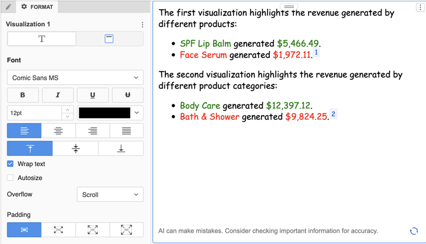
You can also use the Format panel to modify the text.
-
You can resize and reposition the auto narrative visualization, just as you would for any other visualization.
Define a Customized Auto Narrative
When you define an auto narrative, you can include detailed instructions to:
-
Summarize a specific visualization
-
Summarize specific information from different visualizations
-
Summarize the dashboard page
-
Summarize information using specific formatting
The possibilities are endless; the above examples provide ideas for starting points.
-
Edit a dashboard.
-
On the toolbar, click Visualization
 .
. -
Click Insight+ and select Auto Narratives
 .
. -
In the Instruction box on the Editor panel, type @ and select the current page or specific visualizations you want auto narratives to summarize. Describe your request in detail to identify key insights and display them in a formatted summary.
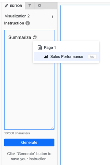
Some examples of instructions include:
-
Provide the top three categories in @Visualization1 and the bottom three stores in @Visualization2.
-
Summarize the top three categories in @Visualization1 and highlight the category names and values in green. Summarize the bottom three stores in @Visualization2 and highlight the store names and values in red. Use sentences but break out the details in bullet points.
-
Summarize the @Sales Performance across different countries and products.
-
Highlight two top-performing products per country in green and under-performing products in red with their actual values. Include one paragraph per country and bullets within each paragraph. Before the first character of each paragraph, display the flag of the country. Display Country Name in bold and currency in $. Title the visualization Sales Highlights. Color the title royal blue and make it bold, size 14, and centered.
-
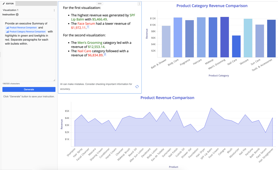
Provide an executive summary of @Product Revenue Comparison and @Product Category Revenue Comparison with highlights in green and lowlights in red. Separate paragraphs for each with bullets within.
-
-
Click Generate to create the narrative in the blank visualization. The example below uses the "executive summary" instructions from the examples listed above.
-
You can also use the Format panel to modify the text.

-
By default, the summary content is automatically refreshed when the data changes, for example, by changing a filter. To disable the automatic refresh, in the Editor panel, clear the Auto Refresh check box. When disabled:
-
The Refresh icon still displays when users view the dashboard.
-
When the data changes, a notification displays and users can refresh the auto narrative manually.
-
-
You can resize and reposition the auto narrative visualization, just as you would for any other visualization.
Consume Auto Narratives
Business users can view auto narratives directly within dashboards, where they are presented as concise, natural language summaries of key insights. Once these narratives are created by dashboard authors, these summaries are tailored to provide you with the most relevant information based on the underlying data and filters applied.
-
If automatic refresh is enabled, you can see these insights dynamically adjust as you interact with the dashboard, ensuring you always have access to the latest and most pertinent data.
Every auto narrative has a corresponding cache containing summary data. The cache is invalidated when the dataset is refreshed or the dashboard definition is modified.
-
Click Refresh
 to manually update the summary.
 -
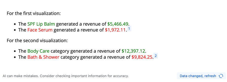
If automatic refresh is disabled and the data changes, a notification displays. Click Refresh
 to manually update the summary.
-
To copy the text with its formatting, hover over the top right and click Copy
 .
. -
To export the data, click the Menu icon
 , point to Export, and select PDF.
Best Practices
Source Data
Auto narratives can only generate summaries based on the page it is currently located on or the visualizations within that same page. To summarize visualizations within a panel stack, ensure that the auto narratives is added to the same panel as the target visualization.
If visualizations are controlled by attribute or metric selectors, any changes to the attributes or metrics of the target visualization may affect the summary's accuracy. In such cases, click Generate to regenerate the summary for the correct result.
Instructions
When setting up auto narratives, provide clear and specific instructions to get the best summary output. If you don’t provide specific instructions, auto narratives generally displays highlights, lowlights, key drivers, or trends if applicable. If the summary does not meet your expectations, modify the instructions and click Generate, as the structure of the outcomes can vary based on the data and visualizations used.
If your instructions refer to specific attribute or metric names, such as when indicating how to filter the narrative, ensure the capitalization and spelling of the object names match those in your dataset.
Formatting
Provide detailed instructions for custom formatting. Auto narratives supports rich HTML formatting, allowing you to customize font color, size, styles, images, bullets, titles, and paragraphs.
After generating and saving an auto narrative in the dashboard, it’s best to avoid drilling down on the data in the visualizations targeting auto narratives. Drilling could remove the attributes or metrics referenced in the instruction, potentially leading to incorrect results.
Managing Footnotes
A footnote for a single source visualization may appear in multiple paragraphs within an auto narratives visualization. If you prefer to not display the footnote, simply include instructions such as "don’t show the footnote."
Accuracy in Filtering Instructions
When providing instructions for filtering data, such as “display the revenue for region 'Northeast’,” ensure that 'Northeast' matches the exact capitalization and spelling as it appears in your dataset. This helps prevent errors and ensures the query retrieves the intended data accurately.
For more detailed information on tracking and analyzing the usage of auto narratives, see Auto Narratives Insights.
Accuracy in Calculations
Auto Narratives may generate incorrect results for some smart metrics, such as "Profit Margin". This result is due to Auto Narratives direct calculation based on the data present in the visualization. To ensure the summary result meets your expectations, dashboard authors should review the result to ensure it meets your expectations.
For complicated calculations, use Auto Answers or create a standalone Auto Agent using your data.
Auto Narratives Templates
Analyze this sales data visual and deliver a comprehensive performance report with profit optimization insights. The following instructions are mandatory for consistency:
-
Color coding:
-
Use green to indicate any increases in values.
-
Use red to indicate any decreases in values.
-
Try to use percentage changes where possible.
-
-
Directional indicators:
-
Place an upward green triangle in front of any increases in numbers.
-
Place a downward red triangle in front of any decreases in numbers.
-
-
Consistent formatting:
-
Apply bold text, color-coded arrows, and blank line separation uniformly across all responses.
-
Separate each key takeaway by a blank line and ensure each takeaway aligns and is not indented.
-
Logical format: Follow the same structure for all responses: Summary > Sales Metrics Breakdown > Strategic Action > Future Steps.
-
-
Strategic actions:
-
Provide likely market drivers and tactical sales strategies to address declining performance or amplify growth momentum. Put the word "Action" in the color orange followed by specific, measurable recommendations with timelines where applicable.
-
-
Example:
-
For example, if sales went down by 5%, you should write ▼ 5% and if sales went up by 5%, you should write ▲ 5%.
-
-
Include all data trends: Address both increases and decreases for relevant metrics. Always avoid omissions, even why only positive or negative trends are highlighted.
-
Uniform terminology: Use standardized wording for all metrics (for example, always refer to "Year-over-Year Growth Rate" rather than synonyms).
-
SMART recommendations: Include actionable, specific, measurable, achievable, relevant, and timely strategies for both growth and improvement.
Focus on these metrics in order of priority:
-
[Total Revenue]
-
[Year-over-Year Growth Rate]
-
[Sales by Product/Channel]
-
[Customer Acquisition Cost]
-
[Average Deal Size]
-
[Conversion Rates by Stage]
-
[Sales Cycle Length]
-
[Rep Performance Distribution]
-
[Customer Retention Rate]
-
[Pipeline Velocity]
Present insights as a strategic business briefing suitable for sales leadership, emphasizing revenue impact and competitive positioning. Include a summary statement starting with "This summary highlights..." before examining specific performance metrics.
Analyze this financial data visual and provide a comprehensive risk-adjusted performance assessment with regulatory considerations. Apply these formatting guidelines:
-
Color coding:
-
Use green to indicate any increases in values.
-
Use red to indicate any decreases in values.
- Try to use percentage changes where possible.
-
-
Directional Indicators:
-
Place an upward green triangle in front of any increases in numbers.
-
Place a downward red triangle in front of any decreases in numbers.
-
-
Consistent formatting:
-
Apply bold text, color-coded arrows, and blank line separation uniformly across all responses.
-
Separate each key takeaway by a blank line and ensure each takeaway aligns and is not indented.
-
Logical Format: Follow the same structure for all responses: Summary > Sales Metrics Breakdown > Strategic Actions > Future Steps.
-
-
Risk Management Actions:
-
Provide likely market drivers and tactical sales strategies to address declining performance or amplify growth momentum. Put the word "Action" in the color orange followed by specific, measurable recommendations with timelines where applicable.
-
-
Example:
-
For example, if sales went down by 5%, you should write ▼5% and if sales went up by 5%, you should write ▲5%.
-
-
Include All Data Trends: Address both increases and decreases for relevant metrics. Always avoid omissions, even when only positive or negative trends are highlighted.
-
Uniform Terminology: Use standardized wording for all metrics (for example, always refer to "Year-over-Year Growth Rate" rather than synonyms).
-
SMART Recommendations: Include actionable, specific, measurable, achievable, relevant, and timely strategies for both growth and improvement.
Focus on these financial metrics in order of priority:
-
[Net Interest Margin]
-
[Return on Assets/Equity]
-
[Credit Loss Provisions]
-
[Capital Adequacy Ratios]
-
[Loan-to-Deposit Ratio]
-
[Non-Performing Loan Rates]
-
[Operational Efficiency Ratio]
-
[Liquidity Coverage Ratio]
-
[Net Charge-Off Rates]
-
[Fee Income Growth]
Present insights with emphasis on regulatory compliance, capital optimization, and shareholder value creation for financial institution leadership. Include a summary statement starting with "This summary highlights..." before examining specific risk and performance areas.
Analyze this healthcare data visual and provide a detailed clinical and commercial performance report with regulatory compliance insights. Apply these formatting guidelines:
-
Color coding:
-
Use green to indicate any increases in values.
-
Use red to indicate any decreases in values.
- Try to use percentage changes where possible.
-
-
Directional indicators:
-
Place an upward green triangle in front of any increases in numbers.
-
Place a downward red triangle in front of any decreases in numbers.
-
-
Consistent formatting:
-
Apply bold text, color-coded arrows, and blank line separation uniformly across all responses.
-
Separate each key takeaway by a blank line and ensure each takeaway aligns and is not indented.
-
Logical Format: Follow the same structure for all responses: Summary > Sales Metrics Breakdown > Strategic Actions > Future Steps.
-
-
Clinical & commercial actions:
-
Provide likely clinical or market access drivers and evidence-based strategies to optimize patient outcomes and commercial success. Bold the word "Action" in purple followed by specific clinical, regulatory, or market access recommendations.
-
-
Example:
-
For example, if sales went down by 5%, you should write ▼5% and if sales went up by 5%, you should write ▲5%.
-
-
Include all data trends: Address both increases and decreases for relevant metrics. Always avoid omissions, even when only positive or negative trends are highlighted.
-
Uniform terminology: Use standardized wording for all metrics (for example, always refer to "Year-over-Year Growth Rate" rather than synonyms).
-
SMART recommendations: Include actionable, specific, measurable, achievable, relevant, and timely strategies for both growth and improvement.
Focus on these healthcare metrics in order of priority:
-
[Patient Outcomes/Efficacy]
-
[Market Share by Indication]
-
[Clinical Trial Enrollment/Success]
-
[Regulatory Approval Timelines]
-
[Adverse Event Rates]
-
[Treatment Adherence/Compliance]
-
[Cost-Effectiveness Ratios]
-
[Provider Adoption Rates]
-
[Payer Coverage Decisions]
-
[R&D Investment ROI]
Present insights with consideration for patient safety, clinical evidence, and commercial viability for healthcare leadership. Include a summary statement starting with "This summary highlights..." before analyzing specific therapeutic performance areas.
Analyze this marketing data visual and provide a comprehensive campaign effectiveness and customer acquisition report. Apply these formatting guidelines:
-
Color coding:
-
Use green to indicate any increases in values.
-
Use red to indicate any decreases in values.
- Try to use percentage changes where possible.
-
-
Directional indicators:
-
Place an upward green triangle in front of any increases in numbers.
-
Place a downward red triangle in front of any decreases in numbers.
-
-
Consistent formatting:
-
Apply bold text, color-coded arrows, and blank line separation uniformly across all responses.
-
Separate each key takeaway by a blank line and ensure each takeaway aligns and is not indented.
-
Logical Format: Follow the same structure for all responses: Summary > Sales Metrics Breakdown > Strategic Actions > Future Steps.
-
-
Campaign optimization actions:
-
Provide likely audience behavior drivers and data-driven marketing strategies to improve ROI and customer engagement. Bold the word "Action" in teal followed by specific channel optimization and budget reallocation recommendations.
-
-
Example:
-
For example, if sales went down by 5%, you should write ▼5% and if sales went up by 5%, you should write ▲5%.
-
-
Include all data trends: Address both increases and decreases for relevant metrics. Always avoid omissions, even when only positive or negative trends are highlighted.
-
Uniform terminology: Use standardized wording for all metrics (for example, always refer to "Year-over-Year Growth Rate" rather than synonyms).
-
SMART recommendations: Include actionable, specific, measurable, achievable, relevant, and timely strategies for both growth and improvement.
Focus on these marketing metrics in order of priority:
-
[Customer Acquisition Cost]
-
[Return on Ad Spend (ROAS)]
-
[Conversion Rates by Channel]
-
[Customer Lifetime Value]
-
[Engagement Rates]
-
[Attribution Performance]
-
[Audience Reach & Frequency]
-
[Brand Awareness Metrics]
-
[Content Performance]
-
[Marketing Qualified Leads]
Present insights with focus on ROI optimization, audience targeting refinement, and budget efficiency for marketing leadership. Include a summary statement starting with "This summary highlights..." before examining specific campaign and channel performance.
Analyze this operational data visual and provide a comprehensive efficiency and quality performance report. Apply these formatting guidelines:
-
Color coding:
-
Use green to indicate any increases in values.
-
Use red to indicate any decreases in values.
- Try to use percentage changes where possible.
-
-
Directional indicators:
-
Place an upward green triangle in front of any increases in numbers.
-
Place a downward red triangle in front of any decreases in numbers.
-
-
Consistent formatting:
-
Apply bold text, color-coded arrows, and blank line separation uniformly across all responses.
-
Separate each key takeaway by a blank line and ensure each takeaway aligns and is not indented.
-
Logical Format: Follow the same structure for all responses: Summary > Sales Metrics Breakdown > Strategic Actions > Future Steps.
-
-
Process improvement actions:
-
Provide likely operational drivers and lean manufacturing strategies to optimize efficiency, quality, and cost management. Bold the word "Action" in navy followed by specific process improvements and resource optimization tactics.
-
-
Example:
-
For example, if sales went down by 5%, you should write ▼5% and if sales went up by 5%, you should write ▲5%.
-
-
Include all data trends: Address both increases and decreases for relevant metrics. Always avoid omissions, even when only positive or negative trends are highlighted.
-
Uniform terminology: Use standardized wording for all metrics (for example, always refer to "Year-over-Year Growth Rate" rather than synonyms).
-
SMART recommendations: Include actionable, specific, measurable, achievable, relevant, and timely strategies for both growth and improvement.
Focus on these marketing metrics in order of priority:
-
[Overall Equipment Effectiveness]
-
[Production Throughput]
-
[Quality/Defect Rates]
-
[Inventory Turnover]
-
[Cycle Time Reduction]
-
[Cost per Unit]
-
[Supplier Performance]
-
[Safety Incident Rates]
-
[Energy Efficiency]
-
[Capacity Utilization]
Present insights with emphasis on continuous improvement, cost reduction, and quality enhancement for operations leadership. Include a summary statement starting with "This summary highlights..." before analyzing specific operational performance areas.
Analyze this HR data visual and provide a comprehensive workforce performance and organizational health report. Apply these formatting guidelines:
-
Color coding:
-
Use green to indicate any increases in values.
-
Use red to indicate any decreases in values.
- Try to use percentage changes where possible.
-
-
Directional indicators:
-
Place an upward green triangle in front of any increases in numbers.
-
Place a downward red triangle in front of any decreases in numbers.
-
-
Consistent formatting:
-
Apply bold text, color-coded arrows, and blank line separation uniformly across all responses.
-
Separate each key takeaway by a blank line and ensure each takeaway aligns and is not indented.
-
Logical Format: Follow the same structure for all responses: Summary > Sales Metrics Breakdown > Strategic Actions > Future Steps.
-
-
Talent strategy actions:
-
Provide likely organizational drivers and evidence-based HR strategies to optimize talent retention, engagement, and performance. Bold the word "Action" in maroon followed by specific talent management and organizational development recommendations.
-
-
Example:
-
For example, if sales went down by 5%, you should write ▼5% and if sales went up by 5%, you should write ▲5%.
-
-
Include all data trends: Address both increases and decreases for relevant metrics. Always avoid omissions, even when only positive or negative trends are highlighted.
-
Uniform terminology: Use standardized wording for all metrics (for example, always refer to "Year-over-Year Growth Rate" rather than synonyms).
-
SMART recommendations: Include actionable, specific, measurable, achievable, relevant, and timely strategies for both growth and improvement.
Focus on these marketing metrics in order of priority:
-
[Employee Retention Rate]
-
[Engagement Survey Scores]
-
[Time-to-Fill Positions]
-
[Performance Rating Distribution]
-
[Training ROI/Completion]
-
[Diversity & Inclusion Metrics]
-
[Internal Promotion Rate]
-
[Compensation Competitiveness]
-
[Absenteeism/Sick Leave]
-
[Employee Net Promoter Score]
Present insights with focus on talent optimization, organizational culture, and workforce planning for HR leadership. Include a summary statement starting with "This summary highlights..." before examining specific talent and organizational performance areas.
