MicroStrategy ONE

How to Use Selectors to Change the Data Displayed in a Document

Selectors provide Report Services documents with interactivity, allowing you to change your view of the data. A selector can change:

  • Panels in a panel stack
  • The data displayed in a grid or graph report
  • The contents of dynamic text fields (a text field that is a reference to an object on a report) in a panel stack
  • The contents of another selector
  • Data displayed in a Transaction Services-enabled document

For example images of using selectors to change the data displayed in a document, see Interacting with a Document: Selectors. Steps are below to choose items for each different selector type.

If the document designer has created a selector to include the All option, you can select All to display data for all the items in the selector.

In Presentation Mode, you can reset all the selectors and groups on the document to their initial values, without re-executing the document. This is helpful if you want to start over and make different selections. To reset, click the menu icon Menu icon (the hamburger) on the right, and select Reset Selections.

By default, when a selector is first displayed and no items are selected, data for all the items is displayed. After you have chosen one or more items to display data for, unselecting all the items in the selector will result in no data being displayed in the selector's target.

The following steps assume that you have opened the document in Presentation Mode or Editable Mode.

Selector Type

Steps

Button Bar

Image of a Button Bar selector

Click the button of the item you want to select. If the designer has created the selector to allow you to choose more than one item, you can click multiple buttons to select them.

Calendar

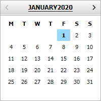
Image of a Calendar selector

  1. To change the beginning date:
    1. Click the calendar icon Calendar icon next to the From field. A calendar is displayed.
    2. Click a day in the calendar to select it.
    3. Click the left and right arrows to scroll through the months.
  2. To change the ending date:
    1. Click the calendar icon Calendar icon next to the To field. A calendar is displayed.
    2. Click a day in the calendar to select it.
    3. Click the left and right arrows to scroll through the months.

checkboxes

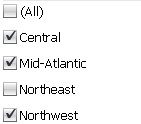
Image of a Check Boxes selector

Click the checkbox next to each item you want to select.

Date Selection

Image of a Date Selection widget

  1. To view data for a specific day, click that date in the calendar.
  2. To view data for a range of dates, hold the SHIFT key as you select the start and end dates of the range.
  3. To view data for a set of non-consecutive dates, hold the CTRL key as you select each date.

For more detailed steps, see Introduction to Selecting Dates in a Date Selection Widget.

Drop-down

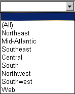
Image of a Drop-down list Selector

Click the selector to display a list of items, then click an item to select it.

Fish Eye

Image of a fish eye selector

Hover the cursor over the selector, then click an item to choose it. The item can be an image instead of text. For an example, see Using a Fish Eye Selector.

Link Bar

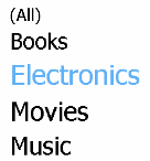
Image of a Link Bar selector

  1. Click the name of the item you want to select.
  2. If the designer has created the selector to allow you to choose more than one item, you can select multiple items by pressing CTRL and clicking additional items.

Listbox

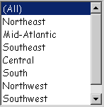
Image of a Listbox Selector

Click the item you want to select. If the designer has created the selector to allow you to choose more than one item, you can select multiple items by pressing CTRL and clicking additional items.

Metric Qualification

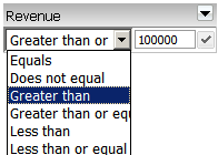
Image of a Metric Qualification selector

  1. You can select metric values by defining a comparison based on the metric. From the first drop-down list, select the operator (equals, greater than, and so on) to use for the comparison
  2. Type the value to filter on in the field. For example, you can choose to display revenue values greater than $5,000,000, or only the top-ranking 5 regions in term of revenue.
  3. Click the check mark to apply the qualification.
  4. To determine how the selector is used to filter data, click the arrow icon at the top right of the title bar to display a list of options, then select one of the following:
    • To filter based on the value of the metric displayed in the selector, select Value.
    • To rank the metric's value, where 1 is the highest value, and then filter by rank, select Rank Highest.
    • To rank the metric's value, where 1 is the lowest value, and then filter by rank, select Rank Lowest.
    • To filter the data to display the top x% of items in the target, select Rank % Highest. For example, if the target Grid/Graph contains eight items, Rank % Highest = 25 displays the top two items.
    • To filter the data to display the bottom x% of items in the target, select Rank % Lowest. For example, if the target Grid/Graph contains eight items, Rank % Lowest = 25 displays the bottom two items.

Metric Slider

Image of a Metric Slider selector


Click and drag the thumbs to define the range of selected values. If the selector's title bar is displayed, you can determine whether to include or exclude data for the selected range, or change how the selector is used to filter data. Perform the following steps:

  1. You can determine whether to include or exclude data for the selected range. Click the arrow icon at the top right of the title bar to display a list of options, then select one of the following:
    • To use the selector to include data for selected values, select Include.
    • To use the selector to exclude data for selected values, select Exclude.
  2. To determine how the selector is used to filter data, click the arrow icon at the top right of the title bar to display a list of options, then select one of the following:
    • To filter based on the value of the metric displayed in the selector, select Value.
    • To rank the metric's value, where 1 is the highest value, and then filter by rank, select Rank Highest.
    • To rank the metric's value, where 1 is the lowest value, and then filter by rank, select Rank Lowest.
    • To filter the data to display the top x% of items in the target, select Rank % Highest. For example, if the target Grid/Graph contains eight items, Rank % Highest = 25 displays the top two items.
    • To filter the data to display the bottom x% of items in the target, select Rank % Lowest. For example, if the target Grid/Graph contains eight items, Rank % Lowest = 25 displays the bottom two items.

Radio Button

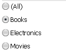
Image of a Radio Button selector

Click the radio button next to the item to select.

Slider

Image of a Slider selector

  1. Click and drag the thumb on the slider to select a value. If the designer has created the selector to allow you to choose more than one item at the same time, you can drag the ends of the thumb to change the range of values selected. When you hover the cursor over the thumb, the selected value (or range of values) is displayed.
  2. You can select the All option by selecting the value at the top of the slider (for sliders displayed vertically) or the leftmost value (horizontal slider).

Action Selector Button or Action Selector Link

Image of an Action Selector Button

  1. Open the document in Presentation Mode.
  2. Click the button or link to submit, recalculate, or discard the changes you have made to the data in your Transaction Services-enabled document. For more steps to use Transaction Services-enabled documents in general, see How to Update Data Using Transaction Services-Enabled Documents.

Related Topics

Interacting with a Document: Selectors

How Links, Drilling, and Selectors Work Together