MicroStrategy ONE
Displaying an interactive event calendar: Date Selection widget
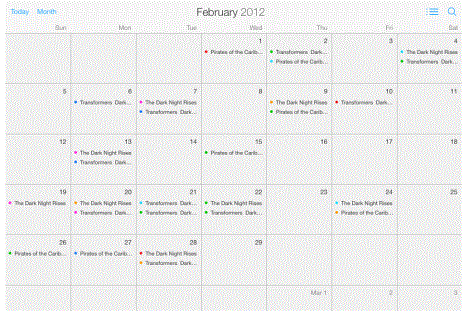
The Date Selection widget displays events in an interactive calendar in either a Month, Week, or Day view on an iPad. An example of a Date Selection widget is shown below:
Use the Date Selection widget as a calendar of events or appointments within your app. Users can select an event to display an Information Window or open a link containing information on the event. If you have Transaction Services, users can then edit or delete events.
For instructions on creating an Information Window, see Providing additional information to users: Information Windows.
You can also use the Date Selection widget as a filter for the data in your dashboard. Users can select an event on the widget and automatically update the rest of the dashboard with data that relates to the event. To do this, you define the Event attribute as a selector.
Prerequisites
For a Grid/Graph to be used as a Date Selection widget, it must include at least two attributes on the rows. These attributes must meet the following criteria:
-
The first attribute represents each day displayed in the calendar, and must contain elements of the Date data type.
-
The second attribute provides the events displayed in the calendar, and uses the following attribute forms:
-
The first attribute form contains a description of the event.
-
The second attribute form (optional) contains the image displayed for the event when the widget is shown in Day View. This attribute form must be of the image data type.
-
The third attribute form (optional) contains the image displayed for the event when the widget is shown in Week View. This attribute form must be of the image data type.
-
-
The third attribute (optional) provides the category name of each event in the calendar, and is used to color-code the events. It uses the following attribute forms:
-
The first attribute form contains the description of the category.
-
The last attribute form (optional) contains the color in which to display the category, stored as a hex value. The value must be of the form 0xFFFFFF or FFFFFF.
Additional attributes, if any, are displayed when a user taps on the event in the calendar.
-
You can add objects from multiple datasets to the Grid/Graph containing the widget. You must have the correct privileges and the project must allow Grid/Graphs to use multiple datasets. For steps to allow Grid/Graphs to use multiple datasets, see the Adding Text and Data chapter of the Document Creation Help.
To create a Date Selection widget for mobile devices
-
In MicroStrategy Web, open the document in Design or Editable Mode.
-
From the Insert menu, point to Widgets, then Mobile, and select Date Selection.
-
Click the location on your document where you want to place the widget. The Grid/Graph containing the widget is displayed.
-
Optionally, resize the widget by clicking and then dragging its handles.
-
From the Dataset Objects panel on the left, select attributes and drag them on to the widget. Place at least two attributes on the Grid/Graph's rows, as described in the prerequisites above.
Formatting a Date Selection widget
You can format a Date Selection widget by:
-
Selecting whether events in the Month view are grouped by day or week. For steps, see To select the grouping of events in the Month view.
-
Automatically assigning colors to event categories. The colors are based on the elements of the categorization attribute of the widget's dataset. For steps, see To automatically assign colors to event categories.
-
Specifying the color of each event category. For steps, see To assign a specific color to each category.
-
Selecting which view (month, week, or day) the widget displays initially. For steps, see To set the default display view.
Prerequisite
The following procedures assume that you have already created the Date Selection widget you want to modify.
To select the grouping of events in the Month view
-
Right-click the widget, then select iPad Properties. The iPad Date Selection dialog box is displayed.
-
From the Month view is displayed by drop-down list, select one of the following:
-
Day: When the widget is shown in the Month view on an iPad, events are grouped by day.
-
Week: When the widget is shown in the Month view on an iPad, events are grouped by the week.
-
-
Click OK to save your changes.
To automatically assign colors to event categories
-
Right-click the widget, then select iPad Properties. The iPad Date Selection dialog box is displayed.
-
From the Color events by drop-down list, select Attribute.
-
From the Series color palettes, select the colors you want to use to display the event categories. Each color will automatically be assigned to a category and displayed when the widget is viewed on a mobile device.
-
Click OK to save your changes.
To assign a specific color to each category
-
Right-click the widget, then select iPad Properties. The iPad Date Selection dialog box is displayed.
-
From the Color events by drop-down list, select Attribute Form. The events are color-coded based on the attribute form that contains the color for each category.
-
Click OK to save your changes.
To set the default display view
-
Right-click the widget, then select iPad Properties. The iPad Date Selection dialog box is displayed.
-
From the Default View drop-down list, select one of the following:
-
Month (default)
-
Week
-
Day
-
-
Click OK to save your changes.