MicroStrategy ONE
Formatting documents for mobile devices
You can ensure that the document displays correctly on mobile devices by defining the display properties, such as whether the document layout is optimized for mobile phones, and whether the page-by bar and re-prompt icon are displayed.
You can format the display properties at the following levels:
-
For each Mobile View. You can create Mobile Views to define how your document appears on different devices, and for different orientations of the device. For example, you can size a graph so that it takes up less vertical space when displayed in landscape orientation on a device. For instructions to define Mobile Views, see Formatting documents for various screen sizes and different orientations: Mobile Views.
-
In multi-layout documents, for each document layout. For descriptions of the layout display properties, see Formatting document tabs: layouts and Disabling swiping between layouts in iOS documents.
You must use MicroStrategy Web to define these properties. For instructions, see the steps below.
Formatting documents for various screen sizes and different orientations: Mobile Views
You can specify how to display documents on iPhone, iPad, and Android devices by using Mobile Views. Mobile Views allow you to quickly and easily determine how the elements of a document are displayed in the following scenarios:
-
When users rotate their devices. For example, you can resize a graph to take advantage of the extra horizontal space when the device is held in landscape orientation, or rearrange the controls on the document to accommodate the extra vertical space when the mobile device is held in portrait orientation.
-
When users access the same document from different devices, which may have different screen sizes. For example, you can size text to take up less room on a mobile phone in one Mobile View, or enlarge an image to fit a tablet in another Mobile View. The document is automatically displayed using the Mobile View that most closely matches the height and width (resolution) of the device's screen.
-
When users access the same document on different iPhone versions, which have different screen sizes. You can create a view for each device, with the corresponding layout height. The objects on each layout can have different sizes and positions.
When you use a Mobile View, controls in the document keep the same basic settings when displayed in different Mobile Views. For example, a selector containing a list of regions targets a graph displaying revenue data. If the user selects the Southeast region from the selector, revenue information for Southeast is displayed in the graph. When the user rotates the mobile device and the document is displayed using a different Mobile View, Southeast remains selected and the data displayed in the graph is unchanged.
Parameters you can change in Mobile Views
Once you have added a Mobile View to a document, you can do the following:
-
Display a preview of the Mobile View in Design Mode or Editable Mode in Web.
-
Edit controls in the Mobile View. You can edit the following options for a control independently in each Mobile View:
-
The position of the control in the document
-
The height and width of the control
-
The height of the control's title bar (for Grid/Graphs, panel stacks, and selectors)
-
Whether the control is hidden. You can determine whether a control will be visible when the Mobile View is displayed on a mobile device. All controls in the document must be included in each Mobile View you define. However, you can hide a control in an individual Mobile View to prevent it from being displayed when the document is viewed on a mobile device. For steps to determine whether a control is visible, see the Document Creation Help.
-
Whether the height and width of the control are automatically determined or are fixed at a specific size
-
The height of a document section
-
Whether a document section can grow or shrink to fit its contents
-
Whether to hide a document section if it has no content
-
Show or hide all controls in the document in Design Mode, regardless of whether they are shown when the document is displayed on a mobile device.
Editing any option that is not included in the list below also edits this property for all other Mobile Views in the document. For example, if you change the background color of a document section to green in one Mobile View, the section is displayed as green in all other Mobile Views.
For example, you want to create two Mobile Views, but only want to display a specific grid in the Mobile View for a single mobile device. You must hide the grid in the Mobile View in which you do not want the grid to be displayed.
By default, the mobile device tries to display a document using the Mobile View that matches the exact height and width of the device's screen. If there is more than one Mobile View with the same height and width as the mobile device's screen, the first of these Mobile Views, as listed in the Manage Views Editor, is used. Otherwise, the mobile device displays the Mobile View whose width most closely matches the width of the mobile device's screen.
Using Mobile Views with multi-layout documents
Documents can contain multiple layouts. When you create a Mobile View, it is automatically available to every layout in the document.
For example, a multi-layout document contains three layouts. If you create a Mobile View to determine how the document is shown on an iPhone, you must edit the controls in each layout to define how the layouts will be displayed. You can use the Orientation option for Mobile Views in conjunction with the Supported Orientation option for document layouts to determine how a mobile device chooses the best Mobile View to use to display a document layout, as follows:
-
If the Supported Orientation of the document layout is set to Both Portrait and Landscape, the document layout is displayed using the Mobile View that most closely matches the height and width of the mobile device, as well as the orientation in which the mobile device is held.
For example, if the mobile device is held vertically, the mobile device attempts to display the document layout using the Mobile View that has Orientation set to Portrait or Portrait and Landscape, and most closely matches the height and width of the device. If only Mobile Views designed to be displayed in landscape orientation have been defined for the layout, the mobile device chooses the best Mobile View from among those defined and rotates the Mobile View to be displayed vertically, to match the orientation of the mobile device.
-
If the Supported Orientation of the document layout is set to either Portrait Only or Landscape Only, the document layout is displayed using the Mobile View that most closely matches the height and width of the mobile device, as well as the Supported Orientation of the layout.
For example, if the Supported Orientation is Portrait Only, the mobile device attempts to display the document layout using the Mobile View that has Orientation set to Portrait or Portrait and Landscape, and most closely matches the height and width of the mobile device. If only Mobile Views designed to be displayed in landscape orientation have been defined for the layout, the mobile device chooses the best Mobile View from among those defined and displays the Mobile View vertically, to match the Supported Orientation of the document layout. The Mobile View is locked to the same orientation as the Supported Orientation option, meaning that if the Supported Orientation is set to Portrait Only and a Mobile View is displayed vertically on the mobile device, the orientation of the layout as displayed on the mobile device remains the same and does not rotate regardless of whether the user rotates the mobile device.
When a document is viewed on the iPhone, the Supported Orientation option determines which layout is displayed on the mobile device. The mobile device then determines the best Mobile View to use to display the layout. For more information on the Supported Orientation setting, see the MicroStrategy Web Help.
To define a Mobile View in a document
-
In MicroStrategy Web, open the document in Design Mode or Editable Mode.
-
From the Tools menu, select Manage Views. The Manage Views Editor opens.
-
Click the Duplicate icon next to an existing Mobile View. A new Mobile View is automatically created.
-
In the Name field, type a name for the new Mobile View.
-
Under the Resolution column, specify the height and width of the mobile device screen on which to display the Mobile View, as follows:
-
In the first field, type the width, in pixels, of the device screen.
-
In the second field, type the height, in pixels, of the device screen.
-
You can specify whether the Mobile View is designed to be displayed on a mobile device when the device is held vertically or horizontally. From the Orientation drop-down list, select one of the following:
-
To display the Mobile View when the device is held vertically, select Portrait Only.
-
To display the Mobile View when the device is held horizontally, select Landscape Only.
-
To display the Mobile View when the device is held vertically or horizontally, select Portrait and Landscape.
-
Repeat the appropriate steps above to define each Mobile View.
-
You can determine which Mobile View to display in Design Mode when the document layout is displayed in Web. Under the Current column, select the Mobile View to display.
-
To delete an existing Mobile View, click the Delete icon next to the Mobile View to delete.
-
You can choose to show all controls in Design Mode in Web, regardless of whether they are marked as hidden. For example, you design a Mobile View to be displayed on the iPhone. The Mobile View contains several controls that will be displayed on the iPhone, as well as a grid that is marked as hidden and will not be displayed. You can choose to display all the controls in Design Mode, including the grid. Do one of the following:
-
To display all controls in the layout in Design Mode, regardless of whether they are hidden, select the Show hidden objects in Design Mode check box.
-
To display only the controls that are specified as not hidden, clear the Show hidden objects in Design Mode check box.
-
Click OK to save your changes.
-
Add controls to the document, such as text fields, images, graphs, and so on. For steps to add controls to a document, see the Document Creation Help. When you add a new control to the document, a message is displayed asking if you would like to make the control visible in all Mobile Views. Do one of the following:
-
To make the control visible in all views, select Yes.
-
To make the control visible in only the current Mobile View, select No.
-
To remove a control from a Mobile View, select the control, and press Delete. A message is displayed asking you if you want to delete the control from the document. To hide the control from the current Mobile View, while keeping it visible in all other Mobile Views, select No.
-
From the Tools menu, select Manage Views. The Manage Views editor opens.
-
Under the Current column, select the Mobile View you want to display.
-
Click OK to save your changes.
-
From the Tools menu, select Manage Views. The Manage Views editor opens.
-
Click the Delete icon next to the Mobile View you want to delete.
-
Click OK to save your changes.
A default Mobile View is automatically displayed in the list of Mobile Views, and cannot be deleted.
To determine which Mobile View to display in Web
To delete a Mobile View from a document
Formatting document tabs: layouts
Each layout in a document can be defined to display on an iPhone, iPad, or Android device independently of other layouts within the same document. Steps are provided below to format a document layout for mobile devices.
For an introduction to multi-layout documents, see the Document Creation Help.
To define how tabs in a document display on mobile devices
-
In MicroStrategy Web, open the document in Design Mode.
-
From the Tools menu, select Layout. The Properties dialog box opens.
-
From the left, under Layout Properties, click Mobile. You can define the following display options:
-
From the Supported Orientations drop-down list, select which orientations you want the layout to support:
-
Portrait Only (height is greater than width)
-
Landscape Only (width is greater than height)
-
Portrait and Landscape
-
You can also define the following display options for documents:
-
To allow users to filter the display of the document by tapping a page-by element from the page-by bar, select the Display page-by interface check box.
-
To allow users to change their prompt answers, select the Display filter interface check box. The Filter button displays on the layout.
-
To use a layout as an Information Window in a Map widget, select the Use as Information Window for the Map widget check box.
-
To prevent Android users from performing actions such as scrolling in the document, choose Optimize layout for micro application. Optimizing the layout for a micro-application prevents allows you to better control the user's experience and interaction with the document.
-
Select Optimize layout for micro application.
-
Click Apply.
-
On the Home toolbar, select either Fit Page or Fit Width from the Zoom drop-down list.
-
You can choose to always open a document in full screen mode. From the left, under Document Properties, click Document, and select the Always open this document in full screen mode check box.
-
To display the navigation bars and action menu when users tap on the full screen button at the top of the app, select the Allow users to access navigation bars and action menu check box (default).
-
To prevent users from accessing the navigation bars and access menu, clear the Allow users to access navigation bars and action menu check box.
-
On the iPad, users are also unable to access the layout bar, which displays the different tabs in the document.
-
On the iPhone in landscape orientation, users are unable to access the layout bar, which displays the different tabs in the document, and the page-by bar. In Portrait orientation, users can access both.
-
Click OK. The Properties dialog box closes.
An Information Window is a small pop-up window that provides additional details about a location. It is displayed when a user selects a map marker in a Map widget. For more information, see Using a layout as an Information Window in a Map widget.
If the document is to be displayed on multiple devices, it is recommended that you use a panel stack as the Information Window. For information, see Providing additional information to users: Information Windows.
Selecting this option allows you to size the layout for Android devices to fit the page or the width of the device's screen. When a user views the document on an Android device, a fit-to-page layout is zoomed and displayed within the screen, so that he does not need to scroll vertically or horizontally to view any data. A fit-to-width layout is zoomed to the width of the screen, so that a user does not need to scroll horizontally to view any data. To do this, complete the following steps:
Documents displayed on an iPhone in landscape orientation are automatically displayed in full screen mode.
When documents are displayed in full screen mode, the navigation bars and action menu are hidden. You can control whether users can access the hidden navigation bars and action menu.
Consider doing this when you want to control how users exit and interact with the document, such as when the document is part of a custom mobile app with its own navigation system.
To allow users to perform actions that would normally be done in the action menu, you can create a link in the document that performs the same action. For example, to allow users to exit the document, you can create a link in the document that opens another document or sends them to a different screen in the app, such as the Home page. For steps, see Using links to access features within the MicroStrategy Mobile application.
Disabling swiping between layouts in iOS documents
By default, users can navigate between layouts in a document by swiping to the left or right. On an iPad or iPhone, you can disable this default so that users must use the layout bar to navigate between layouts.
To disable swiping between layouts in documents on iOS devices
-
In MicroStrategy Web, open the document in Design Mode.
-
From the Tools menu, select Document Properties. The Properties dialog box opens.
-
From the left, under the Document Properties section, click Mobile.
-
Do one of the following:
-
To allow users to swipe between pages or select an option in the layout bar to display a report or document, select the Enable swiping to switch layout check box (default).
-
To disable swiping between layouts and have users switch layout by tapping the layout's name in the layout bar, clear the Enable swiping to switch layout check box.
-
To enable graph tooltips on the device, select the Enable graph tooltips check box.
-
Click Apply. The Properties dialog box closes.
Displaying documents on iOS devices with a dark or light theme
On the iPad and iPhone, you can choose whether documents use a dark or light theme. In the image shown below, the document on the left is using the dark theme, while the document on the right is using the light theme.
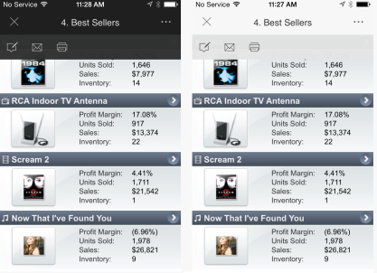
A document's theme controls the colors of its title bar, menu, and may also control the colors of the widgets in the document.
You may want to choose the dark theme if the document's background is also dark, so that the title bar and menu match the document. Similarly, if the document's background is light, you may want to choose the light theme.
You can also display documents with the same theme the app is using. By default, Mobile apps use the dark theme.
To choose which theme a document displayed on the iPad or iPhone uses
-
In MicroStrategy Web, open the document in Design Mode.
-
From the Tools menu, select Document Properties. The Properties dialog box opens.
-
From the left, under the Document Properties area, select Mobile.
-
From the Document theme color drop-down list, select one of the following:
-
If you want the document and its widgets to use the same theme as the rest of the Mobile app, select Application theme color (default).
-
If you want the document to always use the dark theme, select Dark.
-
If you want the document to always use the light theme, select Light.
Enabling automatic refresh for documents
For iPhone, iPad, and Android devices, you can define whether the document refreshes itself as it is being displayed on a mobile device. Automatic refresh is helpful if the data is frequently updated.
Automatic refresh also applies to documents viewed in Express Mode in MicroStrategy Web.
To enable automatic refresh in an iOS or Android document
-
In MicroStrategy Web, open the document in Design Mode.
-
From the Tools menu, select Document Properties. The Properties dialog box opens.
-
From the left, under the Document Properties section, click Advanced.
-
Select the Automatically Refresh check box.
-
In the field, type the amount of time, in seconds, to wait before each refresh.
-
Click OK. The Properties dialog box closes.
Enabling zoom for iOS documents
For the iPhone and iPad, you can define whether you can zoom in and out of the document by pinching and double-tapping.
To enable zooming in an iOS document
-
In MicroStrategy Web, open the document in Design Mode.
-
From the Tools menu, select Document Properties.. The Properties dialog box opens.
-
From the left, under the Document Properties section, click Mobile.
-
Select the Enable zoom (pinch and double-tap) check box.
-
Click OK. The Properties dialog box closes.
Creating an image watermark for an Android document
An image watermark is a faint design appearing in the background of a document. A watermark typically identifies or decorates pages. For example, a business logo can appear in the background of an Android document.
To create an image watermark for an Android document
-
In MicroStrategy Web, open the document in Design or Editable Mode.
-
From the Tools menu, select Document Properties. The Properties dialog box opens.
-
To make the background of the document transparent:
-
From the left, select Color and Borders.
-
From the Color drop-down list, select No Fill.
-
From the left, select Watermark.
-
To create an image watermark:
-
From the Watermark drop-down list, select Image watermark.
-
Type the path and file name of the image in the Source field.
-
By default, the image is automatically resized to fit within the document margins while retaining its aspect ratio. To scale the image manually, select a percentage from the Scale drop-down list.
-
Click OK to return to the document.
The image file must be available to both the Intelligence Server and to the designers of the document.
Setting Info Window to partial screen per panel stack
An Info Window can be set to appear set to a specific initial slide in size and screen position.
-
Right click anywhere on the panel stack to be used.
-
Select Properties and Formatting from the list.
-
In the General > Panel Stack section select the check box for Use as Information Window.
-
In the Mobile Only section, set Window Mode to Slide from the drop down menu.
-
Set Position as desired.
-
Select the check box next to Display in partial screen per panel stack size on mobile phone
-
Set Initial sliding in width if you selected Position Left or Right, or Initial sliding in height if you selected Position Above or Below.
-
Click Apply then OK to close the window.