MicroStrategy ONE
Displaying data trends: Time Series widget
The Time Series widget displays data over a specific period of time on an iPhone, iPad, or Android device. This widget is displayed as a line graph on the device. You can configure the widget to display multiple data series on the same graph. An example of a Time Series widget on an iPhone is shown below.
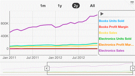
You can configure the Time Series widget to provide data across multiple time intervals. For example, in the image above, data is displayed for a one-month time period. However, the widget can also display data for one year, several years, or for the entire time period. You can add intervals to a widget by configuring the widget's properties.
The number of data points displayed in a Time Series widget is determined by the maximum number of rows displayed in the grid on which it is based. For steps to change the number of data points displayed in a Time Series widget in a document, see To determine the maximum number of data points displayed in a document.
For iPhones and iPads, you can define:
-
Information Windows that display when the widget is tapped.
-
A link in the widget to open a report or another document.
For a Grid/Graph to be used as a Time Series widget, it must meet the following requirements:
-
At least one attribute on the rows. The attribute provides the values along the horizontal axis of the widget, and should be time-based.
-
At least one metric on the columns. The metric values are graphed in the widget.
-
To view data for multiple series, place at least one attribute on the columns. The attribute elements are graphed on the widget's axis.
-
Ensure that the row and column headers of the report are not merged.
You can add objects from multiple datasets to the Grid/Graph containing the widget. You must have the correct privileges and the project must allow Grid/Graphs to use multiple datasets. For steps to allow Grid/Graphs to use multiple datasets, see the Adding Text and Data chapter of the Document Creation Guide.
-
In MicroStrategy Web, open the document in Design or Editable Mode.
-
From the Insert menu, point to Widgets, then Mobile, and select Time Series.
-
Click the location on your document where you want to place the widget. The Grid/Graph containing the widget is displayed.
-
Optionally, resize the widget by clicking and then dragging its handles.
-
From the Dataset Objects panel on the left, select attributes and metrics, and drag them on top of the widget, as described in the prerequisites above.
-
Right-click the widget, then select Properties and Formatting. The Properties and Formatting dialog box opens.
-
From the left, select Widget.
-
Click the Widget Properties icon
 . The Time Series Properties dialog box opens.
 -
To add an interval selector, complete the following steps:
-
Click Add. The new selector is added and displayed.
-
Type a name for the selector in the Name field.
-
From the Template drop-down list, select the control in the document that contains the time-based attribute you want to use to create the interval selector. The granularity is automatically determined by the last (right-most) attribute on the Grid/Graph's rows, as described above.
-
From the Interval unit drop-down list, select the units in which you want to specify the length of the time interval. For example, to define a six-month interval, you can select Month as the interval unit.
-
Type the number of units you want to include in the interval in the Interval size field. For example, if the Interval unit is defined as Month, you can type 6 to specify a six-month time interval.
-
A summary of the interval selector's properties is displayed in the bottom pane. Repeat the appropriate steps above to add additional interval selectors.
-
You can rearrange the order in which an interval selector is displayed. Click Move up or Move down to change the position of the selector.
-
To delete an interval selector, select the interval selector's name in the Interval Selector list to the left, then click Remove. The interval selector is removed.
-
You can use the slider to filter the data in your dashboard, so that only the data selected in the slider is displayed. Select the Use slider as selector check box.
-
Click the Formatting tab.
-
To change the background color of the widget, select a color from the Background palette.
-
To change the color of the text and lines, select a color from the Line and Text palette.
-
The color of each series is displayed in the Series palettes. To change the color of a series, select a color from the corresponding palette.
-
From the Background transparency drop-down list, select a level of transparency. The higher the percentage, the more transparent the background is.
-
By default, axis labels are condensed, which means the widget allocates more space to the chart area than to the labels. You can change this behavior by clearing the Condense labels check box.
-
You can specify the minimum and maximum values of the axis, by completing the following steps:
-
Select the Custom axis scale check box.
-
Type the Maximum axis value.
-
Type the Minimum axis value.
-
Click OK to return to the Properties and Formatting dialog box.
-
Click OK again to save changes.
To create and add a Time Series widget to a document
Android devices can only display up to two metrics in a Time Series widget.
To configure the widget's display properties
To add an interval selector to the widget
Interval selectors let users select the time period for which they want to view data in the widget, allowing them to analyze data at different levels of detail. You can add, rearrange, or delete interval selectors in a Time Series widget, as described below.
To use the slider as a selector
To format colors, labels, and the axis scale
To determine the maximum number of data points displayed in a document
Increasing the number of rows that can be displayed in a grid may affect performance when the document is displayed.
-
Open the document containing the widget in Design or Editable Mode.
-
Right-click the widget's Grid/Graph and select Properties and Formatting. The Properties and Formatting dialog box opens.
-
From the left, select Grid.
-
Select the Enable incremental fetch in Grid check box.
-
From the Count By drop-down list, select Individual Rows.
-
Type the maximum number of data points to display in the widget in the Maximum number of rows per page field.
-
Click OK to save changes.