MicroStrategy ONE
Analyzing data on a time-based graph: Time Series
Reports and documents can include a line graph that displays data over a period of time. The graph may contain multiple data series. For example, the values for the various profit and revenue metrics for the Books and Electronics categories for a two-year period are displayed in the image below:
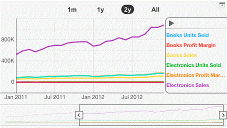
Use the slider at the bottom to select a time period to view. The highlighted section is the time period you are currently viewing.
The actions that you can perform with the graph depend upon how the graph was designed. You may be able to do any of the following:
-
Change the orientation of the graph between portrait and landscape by rotating the device.
-
To view data for a specific amount of time, tap one of the time periods at the top of the graph. In the example above, you can select either a six-month or twelve-month time period.
-
To display tooltips, tap and hold on the graph. For example, if you tapped and held on the Books Revenue graph line for September, the tooltip would display $93,728.
-
To scroll through the time axis, drag the slider below the graph.
-
To view a longer or shorter period of time, drag the left or right edge of the slider to adjust its size.
-
To view a legend of all the metrics, tap the bar on the right edge of the graph. The example already displays the metric legend. You can select a metric to highlight it in the graph.