MicroStrategy ONE
Pivoting data
Data pivoting enables you to rearrange the columns and rows in a report so you can view data from different perspectives.
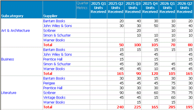
For example, in the image below, the Inventory Received from Suppliers by Quarter report shows a set of data spread across the screen in a large grid display. (The image below shows only a small section of the full report.) It is not always easy to compare numbers in reports of this size.
If you pivot the objects on the report, so that the objects that were in the columns are now in the rows, and the objects that were in the rows are now in the columns, much of the data is easier to read and compare, as shown in the image below.
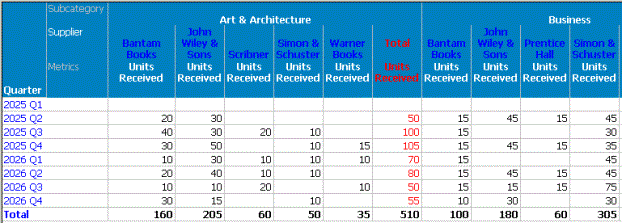
For example, in this pivoted report it is simpler to analyze total units received each quarter within a subcategory of books, because the totals are listed in a single column, making them easy to compare. Any anomalies in the numbers quickly become apparent. To perform the same comparison analysis with the first report above, you must visually skip over groups of data and try to focus only on totals.
With data pivoting, you can do the following:
- Move an object (a business attribute or a metric calculation) and its related data from a row to a column.
- Move an object (a business attribute or a metric calculation) and its related data from a column to a row.
- Change the order of objects in the rows.
- Change the order of objects in the columns.
All metrics are kept together on a report, so they must be moved as a group when pivoting data. For example, on a grid report you cannot move one metric to a row and another to a column. For graph reports, metrics must all be together on only one axis. To pivot metric data, select the word "Metric" in the header to move all metrics together.